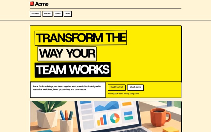
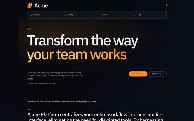
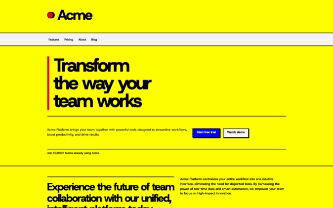
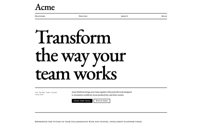
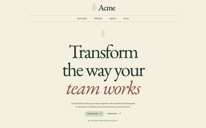
DesignPrompts lets you compare Builder Presets while keeping the same SaaS page plan. For Relay, the fictional salon-booking product in this article, start with Clear Day. Its light background, sans-serif type and regular spacing give you a straightforward direction for explaining the software. Use the other looks to test a specific change in emphasis.
Open Start and choose SaaS launch to follow along. The five Presets below change the page's visual instructions while keeping the template and product brief fixed.
Hold the product and page plan fixed
Relay is a fictional appointment-booking SaaS for independent salons. It lets a salon publish availability, accept bookings and send reminders. The page's primary action is Book a demo.
Use that same brief for every comparison. Keep the SaaS launch plan in the same order: site header, hero, logo cloud, features, process, testimonials, pricing, FAQ, closing and footer.
Those are template sections. Relay has no supplied customers, testimonials, prices or usage figures. Remove those unsupported sections and hero extras before handing the page to an agent for implementation. During the comparison, their positions simply help you judge how each look treats the same page structure.
The table describes actual Preset settings and the instructions they produce. Builder's preview is a wireframe, and its sample content is illustrative.
| Preset | Background treatment | Typography | Section spacing and default imagery |
|---|
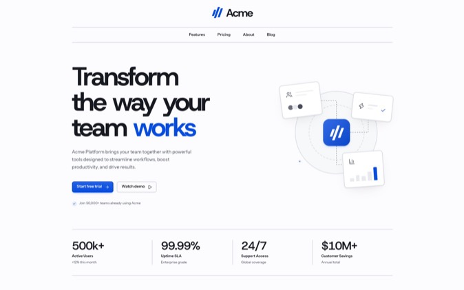
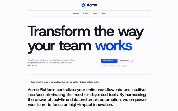
| Clear Day | Near-white, one background | Host Grotesk headings; Instrument Sans body | Regular; framed UI mockups |
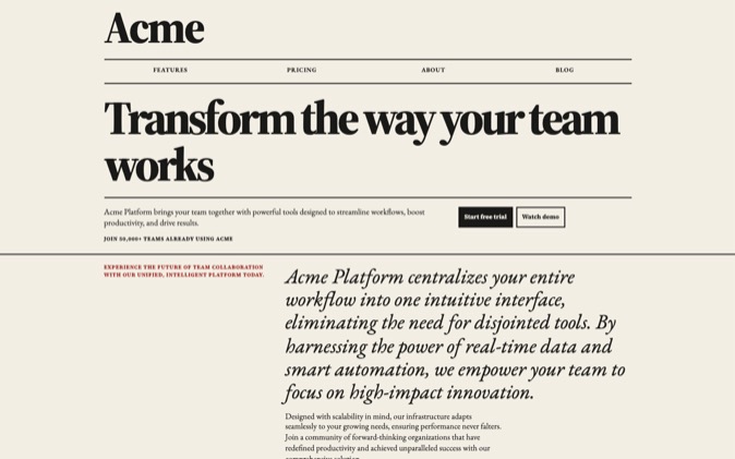
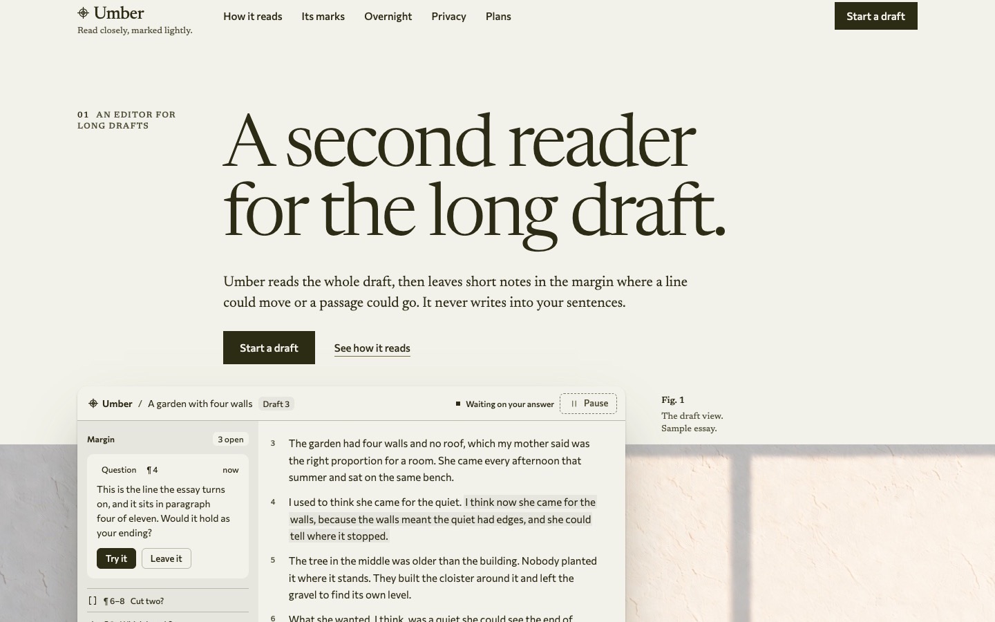
| Paper Trail | Warm light ground; varied section backgrounds | EB Garamond headings; Host Grotesk body | Roomy; screenshots in browser frames |
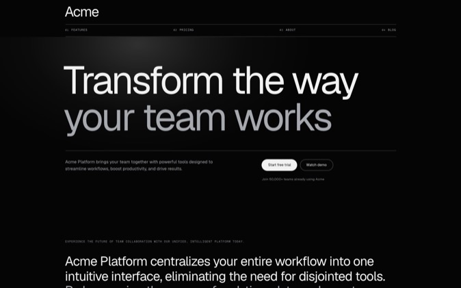
| Basalt | Dark ground; outlined content blocks | Host Grotesk headings; Instrument Sans body | Regular; framed screenshots |
| Strong Room | Near-black ground; raised cards | EB Garamond headings with italic emphasis; Host Grotesk body | Roomy; full-bleed UI mockups |
| Boardroom | Light ground with inverted key sections | Host Grotesk headings; Instrument Sans body | Regular; framed UI mockups |
The imagery column describes the page-wide default. A section can carry its own image choice. In this template, the hero does, as explained below.
What each Preset changes for Relay
Clear Day
Clear Day uses round corners, inset cards and a dark pill-shaped primary button on a near-white page. Its imagery instructions keep images neutral and reserve colour for status information.
I would start here for Relay because the brief is about a practical software workflow. The feature rows can explain availability, bookings and reminders without requiring a photographic brand concept. The heading-to-body size setting is 5.0, giving the product statement clear prominence over its explanation.
Keep the booking interface legible when you supply it. If colour inside that interface carries information you need to preserve, compare Paper Trail's product-imagery treatment before committing to neutral images.
Paper Trail
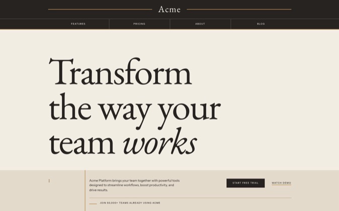
Paper Trail pairs EB Garamond display type with Host Grotesk body text. It uses roomy section spacing, inset cards, varied backgrounds and a dark rounded button. Full colour belongs in the product imagery while the surrounding page stays mostly neutral.
Choose it when Relay's written explanation deserves more emphasis or when the product screenshots need their colour. The serif headings create a more pronounced distinction between display and reading text than Clear Day's two sans-serif faces.
Judge it using your actual headline. A longer sentence needs a useful line break and enough room for the product image beside it.
Basalt
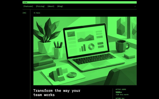
Basalt keeps a dark background and separates content with subtle outlines. Cards are flat, section spacing is regular and the primary button uses pale blue. Its headline size setting is 3.9 times body size, smaller than Clear Day's 5.0 setting.
It also enables Actions beside headings, which places applicable section actions alongside their headings. The hero and forms keep their own action arrangements.
Try Basalt when you want Relay to use a dark software presentation with framed product captures. Check the real booking screen against that ground: its text, controls and surrounding frame need to remain distinguishable.
Strong Room
Strong Room combines a near-black background with serif headlines, italic emphasis on the final headline phrase, roomy spacing and raised cards. The primary action is a white pill. Its page-wide imagery setting requests full-bleed UI mockups, with colour concentrated in product imagery.
This gives you a more editorial direction to consider. Choose it if that type treatment belongs to the brand you want Relay to have, then check that the headline still explains the product plainly.
The Preset's description names finance software as a use case. That is a suggested fit, not a restriction on the product you can build.
Boardroom
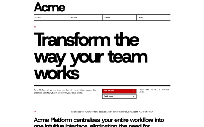
Boardroom starts with a light ground but puts the hero, closing and footer on the inverse ground. It groups section backgrounds in pairs, uses inset cards and keeps regular spacing. Its default imagery is framed UI mockups with neutral images and colour reserved for status.
Like Basalt, it enables Actions beside headings.
Try Boardroom when you want the opening and closing to stand apart through background contrast. On Relay's plan, inspect whether those changes help organise the product explanation. The Preset's enterprise and finance description does not establish that salon owners will trust it more.
Why the hero keeps its browser frame
The SaaS launch template gives its hero two explicit choices: Screenshots and Browser frame. Those choices remain in the generated hero instructions across all five Presets.
That means Strong Room's full-bleed UI setting does not automatically remove this hero's browser frame. Clear Day's UI mockup default does not automatically turn the hero into a recreated interface either.
This is useful when a page needs a particular kind of evidence in one section. The page look sets a default; the section can state what its content needs. Choose your Preset first, then refine the hero in Builder if you want a different image type or frame. Applying another Preset resets block style changes to the template's defaults.
Choose a look for the material you have
For Relay's current brief, my first choice remains Clear Day. It gives the product explanation a light, regular layout with a clear primary action. Paper Trail is the next comparison if the copy needs more editorial character or the screenshots need to retain their colour.
Use DesignPrompts to make that decision on the page:
- At Start, select SaaS launch and Clear Day.
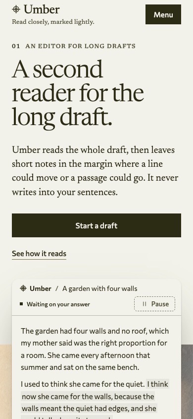
- Keep the template fixed while comparing the other Presets at Desktop and Mobile widths.
- Choose Edit in Builder, remove unsupported proof and pricing, and adjust the sections your content needs.
- Enter Relay's product facts and Book a demo in the brief, then inspect and copy the prompt.
A Builder Preset supplies design choices for your agent. Installable React files belong to LandingKit; choosing a Preset does not select a pack. For the broader selection method, read the design-direction guide.
Open Start to compare the five looks on your own page plan. It is free and needs no sign-up.