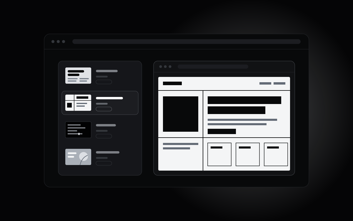
Choose a page structure that fits your content, then a visual direction that fits your product. DesignPrompts' free Start lets you compare both in a preview before handing a prompt to your coding agent. You can make the design decisions while they are still easy to change.
Choose the page shape
Start with what the visitor needs to see and do. A shop needs room for products and prices. A studio needs to show its work. A waitlist page needs a clear reason to leave an email address.
The Start offers twelve templates, including SaaS launch, Mobile app, Developer tool, Studio, Portfolio, Shop and Waitlist. Choose the closest structure, then use Edit in Builder to add, remove or rearrange blocks. Blank is available in the Builder for an empty starting page.
Write the primary action and list your real assets before choosing. A detailed product screenshot needs a different amount of room from an install command or a portrait.
Choose a Preset for the Look
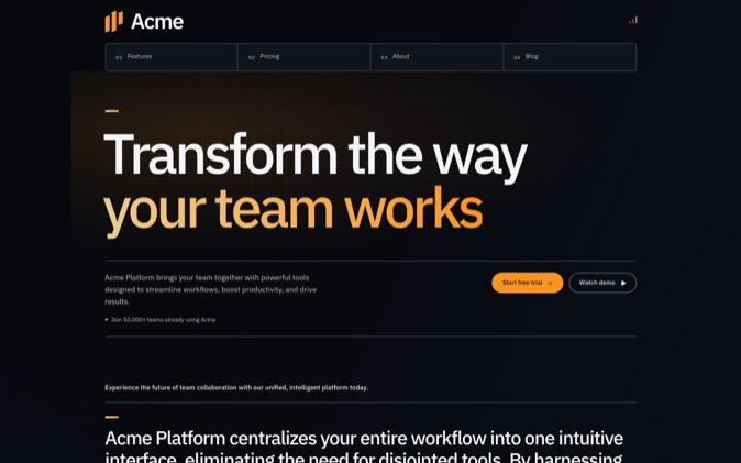
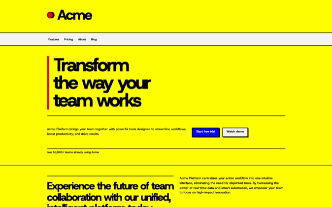
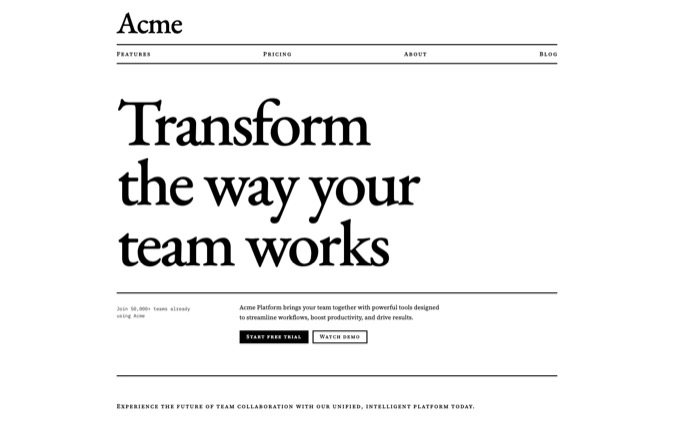
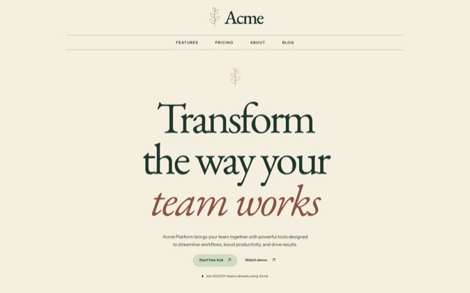
A Preset changes the look independently of the page template. Keep the structure fixed while you compare typography, colour, spacing and imagery. These examples are starting directions, not a complete catalogue:
| Your material | A Preset to try | What to inspect |
|---|
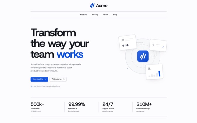
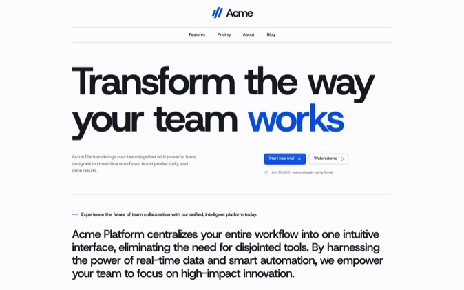
| Product screenshots and a software brief | Clear Day | The space around the product and the heading hierarchy |
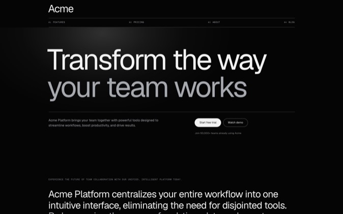
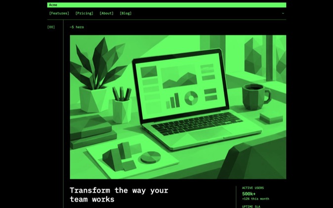
| An install command and technical explanation | Terminal | Monospaced type, rules and content density |
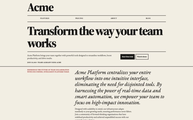
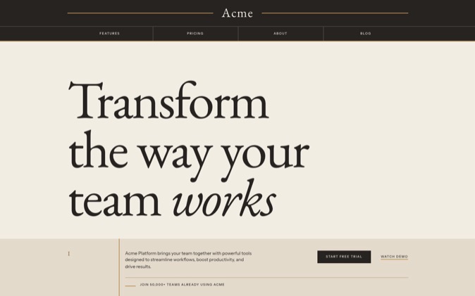
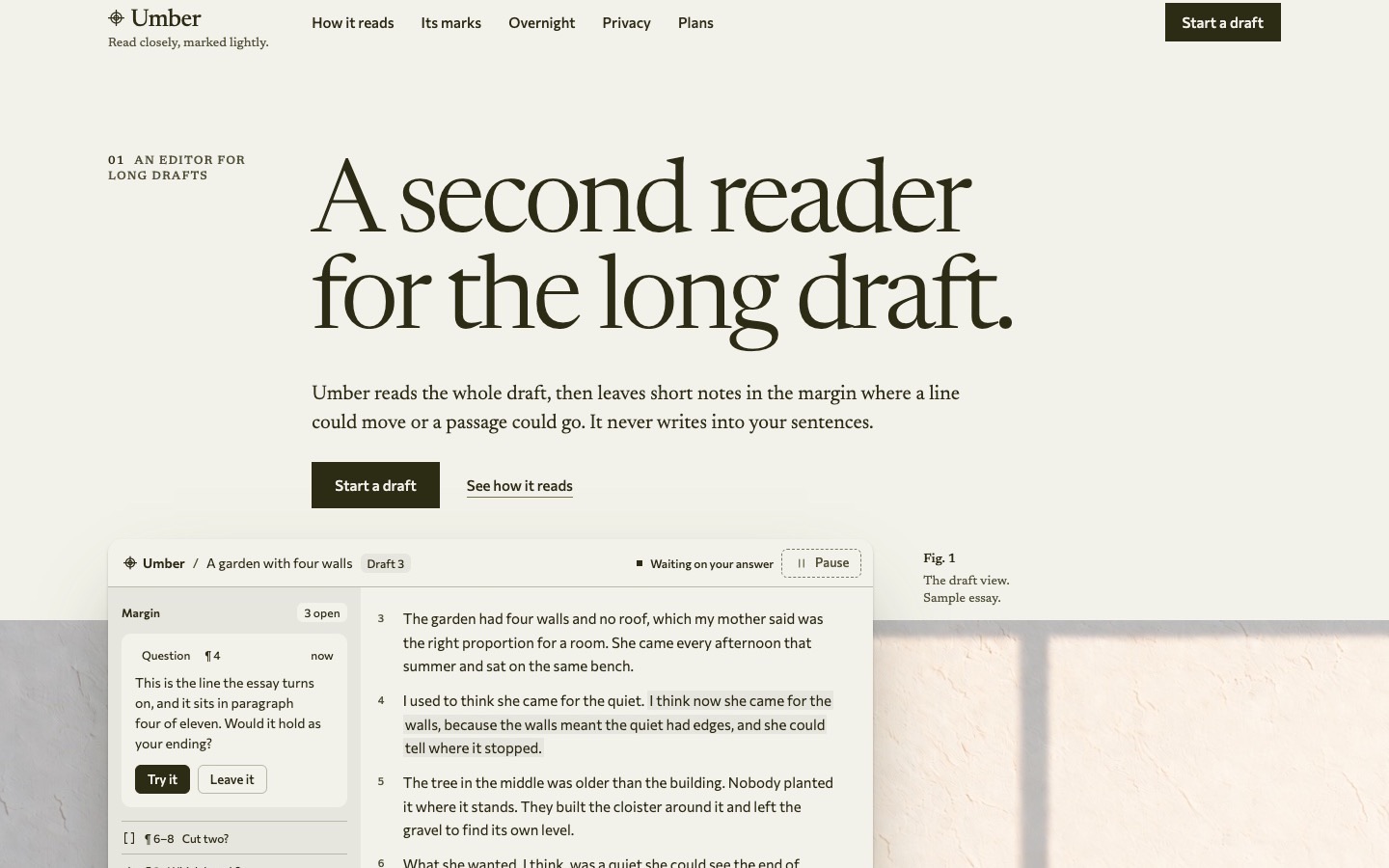
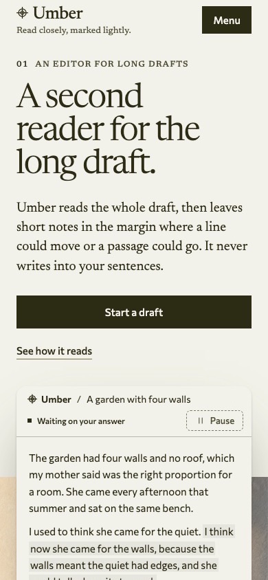
| Writing and a strong editorial voice | Ink Editorial | Reading width and serif headings |
| Large product photographs | Storefront | Image proportions and the product grid |
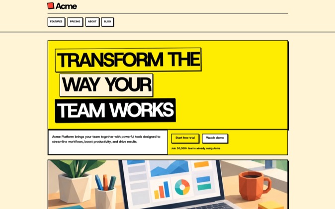
| A studio's visual portfolio | Poster | Scale, sharp edges and room for the work |
| A neighbourhood business | Main Street | Photography, warmth and the path to contact |
The Start's picker has the current Presets and previews. Choose by the content you have, then adjust the look in the Builder if it needs refinement.
Judge the decisions together
Look through the whole preview. Does the main image have enough room? Can the heading carry your actual words? Does the section order answer a visitor's questions before asking them to act?
For example, try the Developer tool template with Terminal when the product is a CLI. If your main proof is a large visual dashboard, compare Clear Day on the same plan. Keep the option that explains your product more clearly.
Then choose Edit in Builder to adjust blocks, layouts and options. Changing one decision at a time makes it easier to see what helped.
Compare authored styles
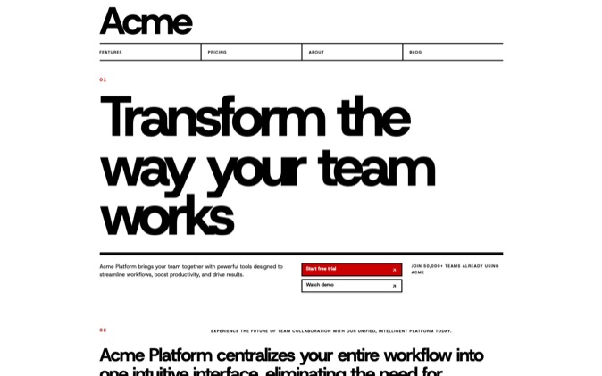
If you want working code with the visual decisions already applied, browse LandingKit's 21 styles. Software offers a light product direction, Terminal uses monospaced type on black, and Newsprint uses editorial columns and serif hierarchy.
Each style page links to its component pack. A LandingKit style supplies installable React files; a Builder Preset supplies choices for a prompt. Selecting a Preset does not install or select a LandingKit pack.
For a finished page with its code, design rules and agent skills, inspect the Premium Gallery. A System is the more complete starting point when its authored page fits your brief.
Give the agent your choices
At the Start, select Get prompt, add an optional product line and choose Copy prompt. If you have shaped the page in the Builder, copy the prompt there.
Give the agent your real copy, assets and any behaviour it must preserve. The prompt supplies the page plan and visual choices; the agent implements them in your project. Review the rendered result against the direction you picked.
Choose your template and look at the Start. It is free and needs no sign-up.