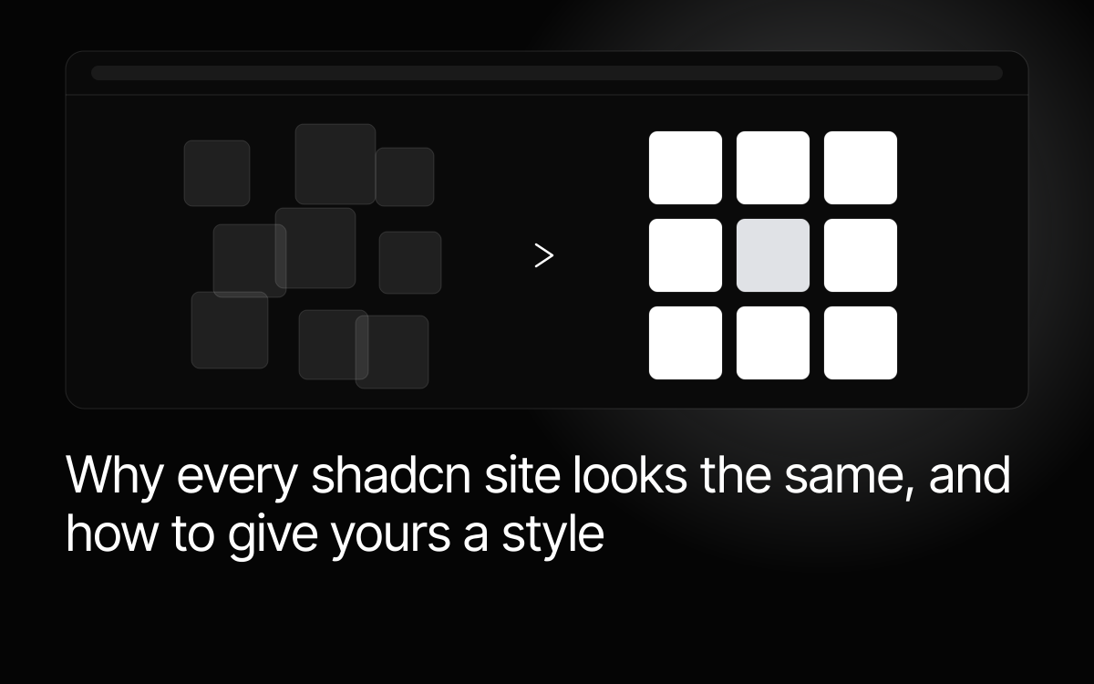
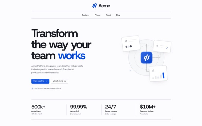
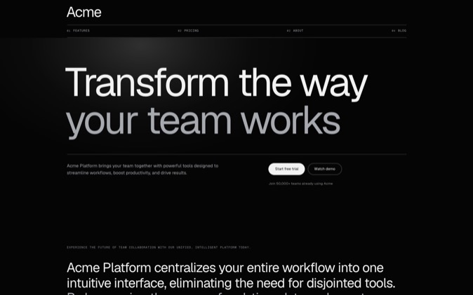
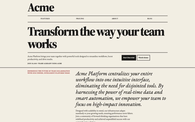
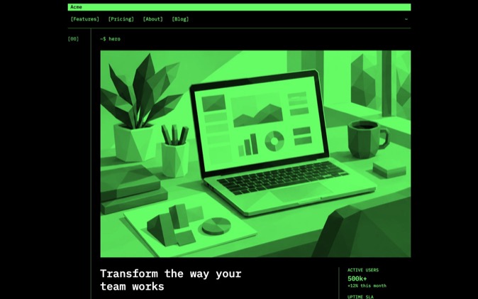
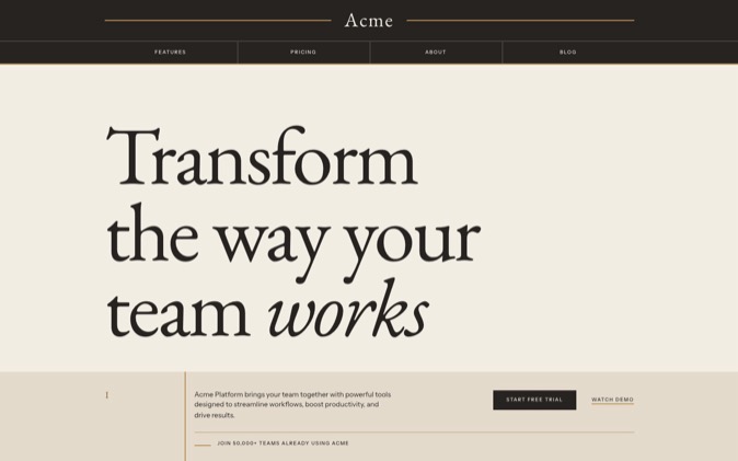
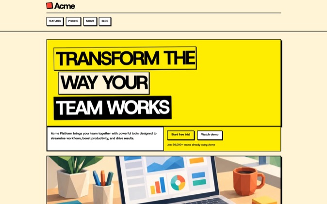
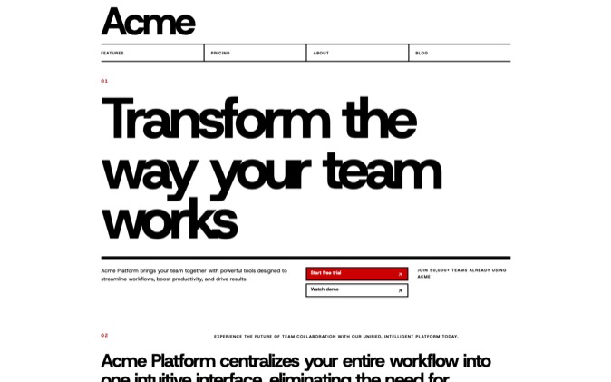
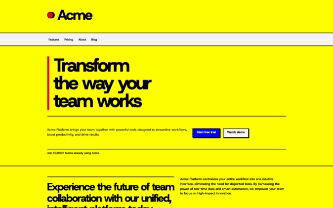
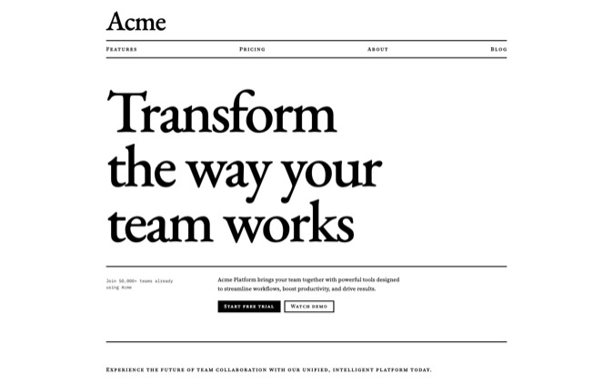
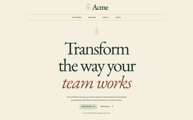
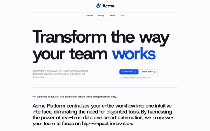
A shadcn site looks familiar when its default tokens, typography and copied layouts stay as they came. Give it a style by choosing those values deliberately, changing the page's composition and recording the decisions your team and coding agent should follow. DesignPrompts LandingKit supplies 21 authored styles with those decisions already applied, so your agent can start from a direction you have chosen.
Why it happens
The familiar look often comes from repeated defaults. The same type scale, content width, rounded cards and section arrangements produce recognisable pages even when the text and accent colour change.
That does not mean shadcn has one compulsory design: its current documentation supports custom themes, fonts, radius choices and semantic tokens. The sameness appears when a project leaves its chosen starting theme untouched. shadcn theming documentation, checked November 5, 2026.
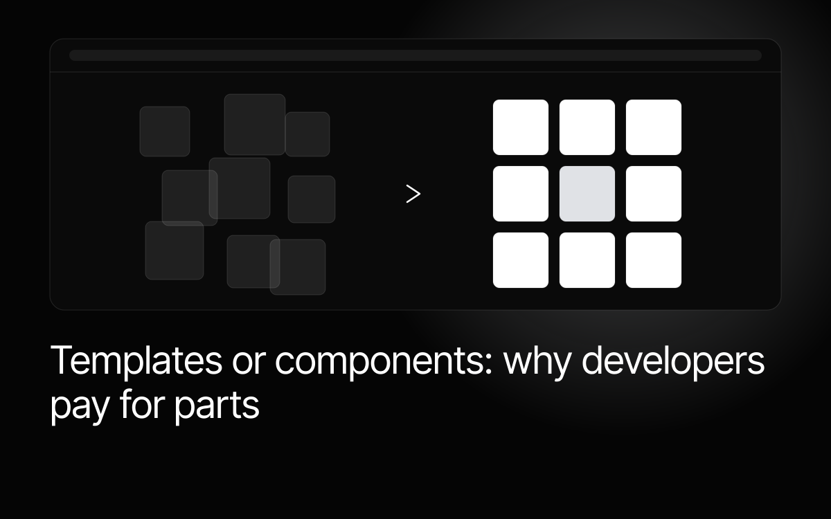
Copied blocks carry layout decisions as well as code. A centred introduction followed by equal-sized cards still has the same composition after you change the colour. If every section arrives from a separate example, spacing and hierarchy can also vary within the page.
Coding agents need enough context to make a different choice. A request for a "modern landing page" leaves type, density and composition open, and without a project-specific reference, familiar patterns are a plausible result. Across a team, separate requests can then create small differences in buttons, panels and headings.
What fixes it
-
Define the page's character through visible choices. Write what should be prominent and what should be quiet. For a documentation product, that might mean compact navigation, generous reading width and restrained decoration. For an image-led portfolio, the work may occupy most of the opening screen. Treat these as decisions about content.
-
Change the shared tokens. Set background and foreground pairs, surfaces, borders, accents and focus treatment together. Use the existing semantic roles so a change reaches every component that uses them. Check real text and control states after changing a colour.
-
Choose a type hierarchy. Decide how headings, body copy, navigation and small labels differ, and specify their sizes, weights, line heights and reading widths. Changing the font alone leaves much of the original hierarchy intact.
-
Set a radius and spacing policy. Decide which elements share a corner treatment and when an exception is useful. Choose a spacing scale, then use it for control padding, groups, section gaps and page margins. Record how dense application areas relate to more spacious marketing sections.
-
Recompose copied blocks. Work from your content. A detailed product screenshot may need more space than the original illustration, and a long explanation may need a reading column instead of three cards. Change the layout where the information requires it.
-
Write a design contract. Put the decisions in DESIGN.md, with references to the CSS that owns the values and the pages that demonstrate them. Explain the reasons. "Keep comparison rows compact so buyers can scan several plans" gives an agent more guidance than "make it clean."
-
Check a second page. Build a form, detail page or dense content section with the same rules, and inspect it at desktop and phone widths. A style that works only for the hero still needs decisions before it can guide a product.
Keep the review concrete. Compare heading wraps, alignment, spacing, focus states and the treatment of real content. Ask the agent to point to the rule or reference behind any choice you are unsure about.
Where DesignPrompts fits
The Style pages show each pack's design decisions working together. Swiss Minimalist uses a visibly divided grid, black rules and strong typography. Bauhaus uses primary-colour fields, black seams and hard offset shadows. Each page links to the corresponding Style pack and to Pro.
Pro's LandingKit applies 21 styles to the catalogue. Choose a Style pack when its type, spacing and motifs fit the product, then install and edit the parts you need.
A System goes further: a complete landing page with its source, design contract, prompts, agent skills, assets and proof. Those files give the agent an example and rules to work from.
Try the same content in two directions. A short software brief in Swiss Minimalist will have different hierarchy, spacing and geometry from the same brief in Bauhaus. That is the kind of visible choice to settle before asking your agent to extend the page.
Open the free Start to choose a page shape and look for your agent. If you want the styled code ready to adapt, compare LandingKit packs or choose a complete System. Both are included in Pro.