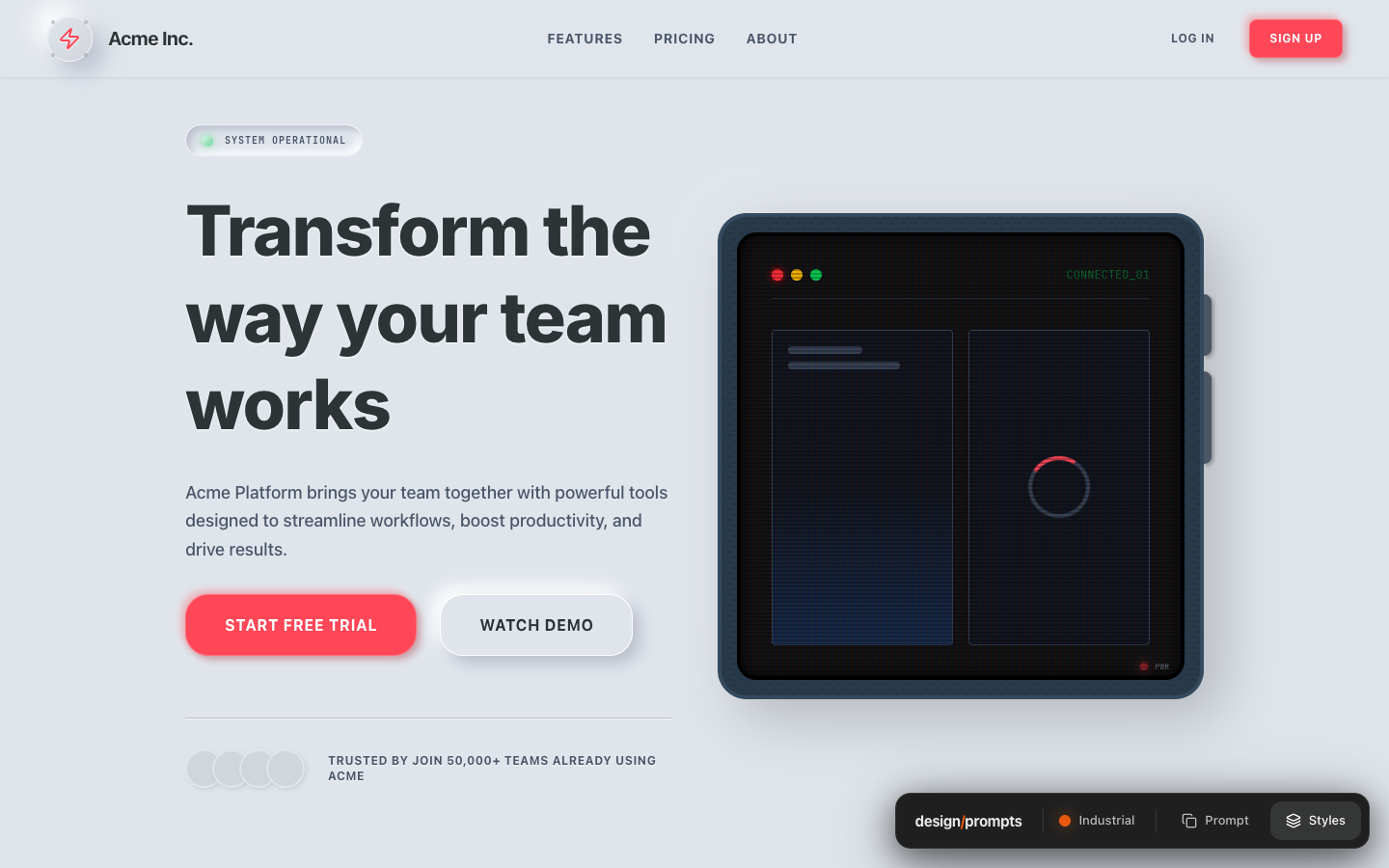
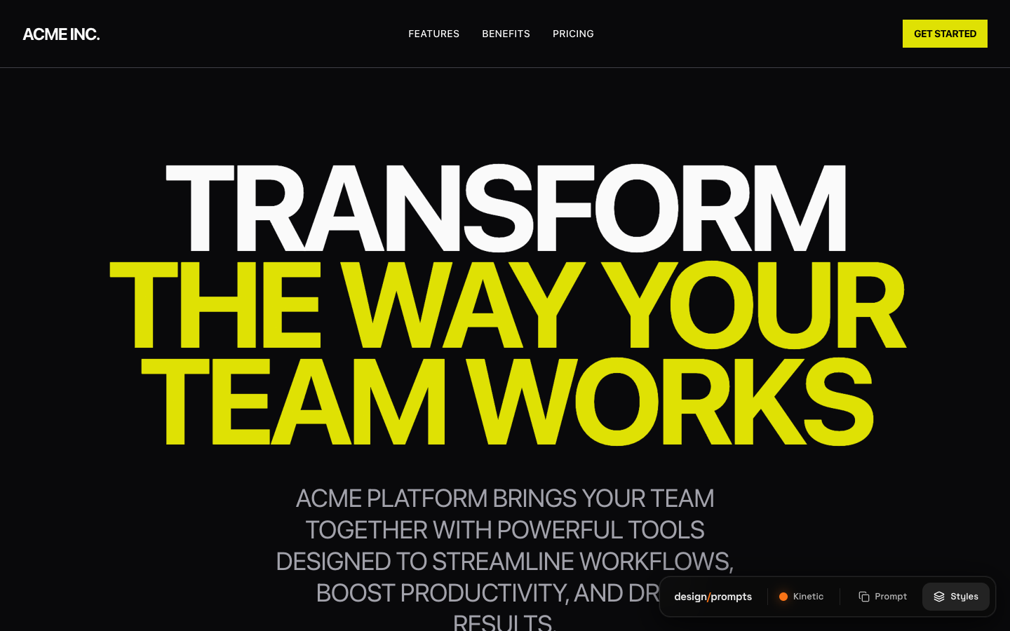
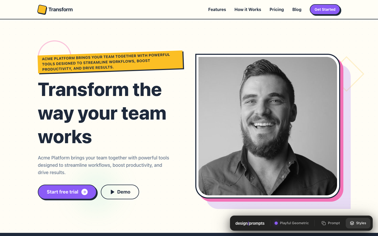
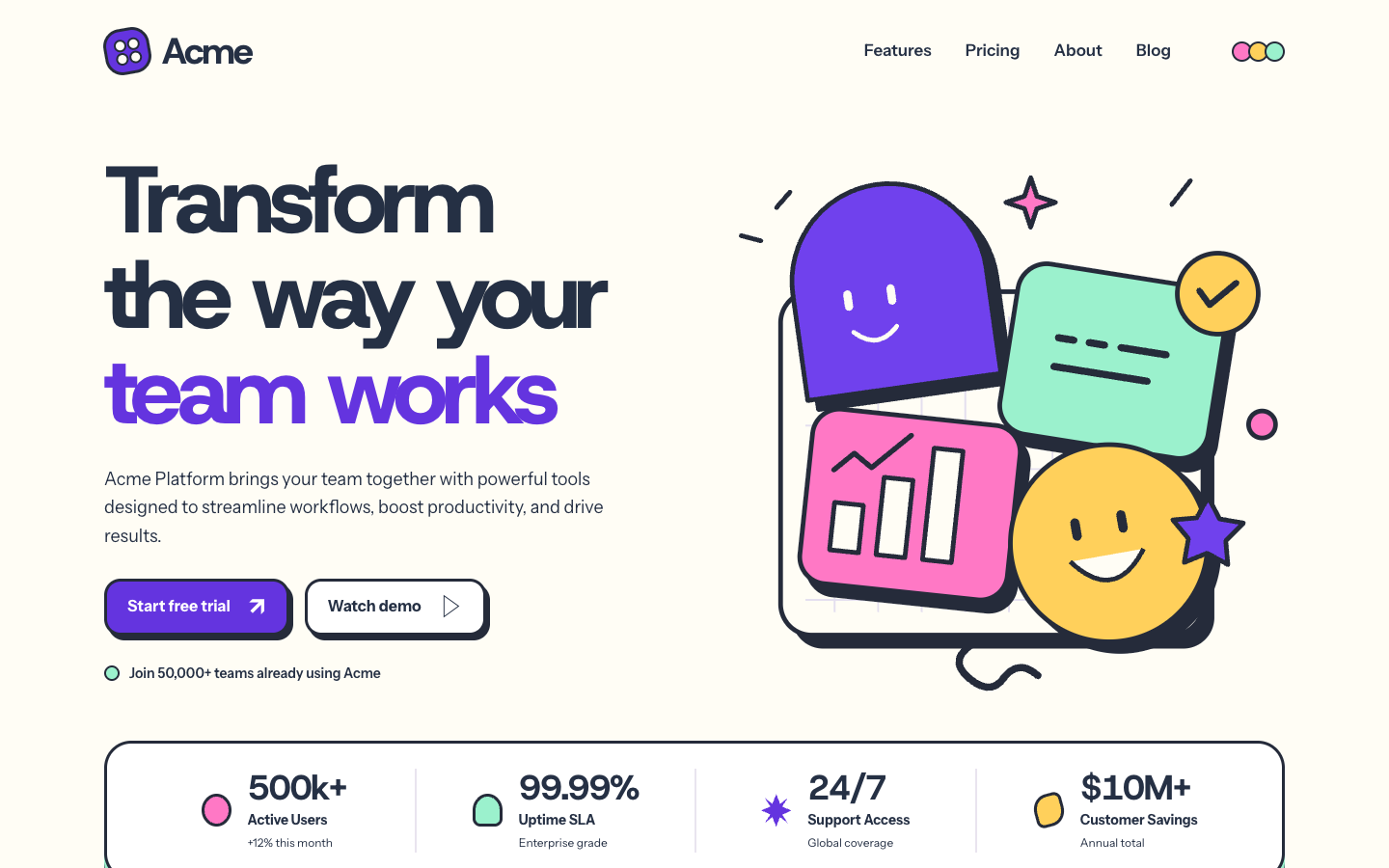
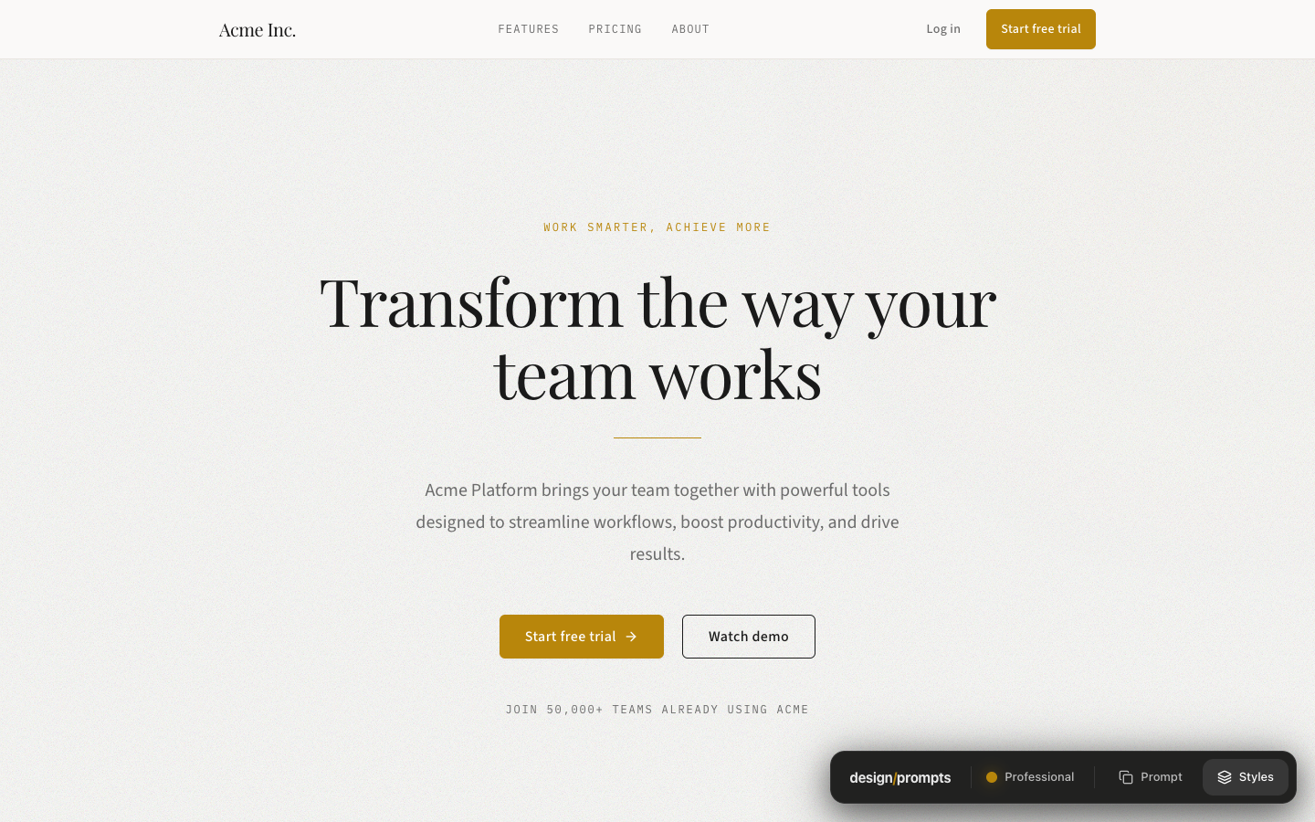
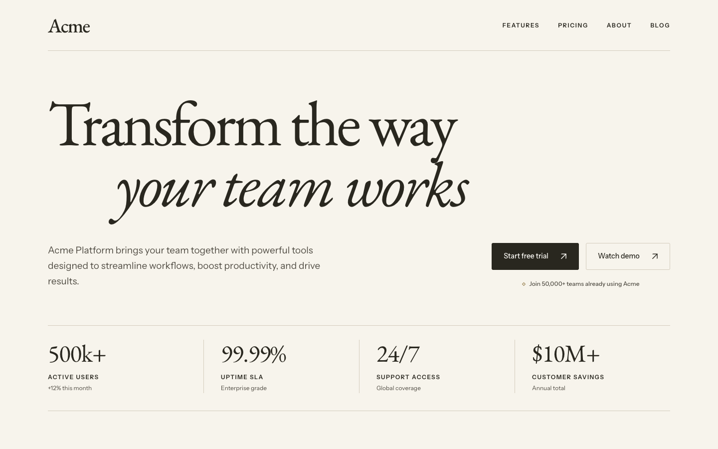
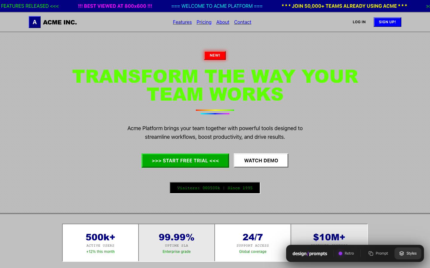
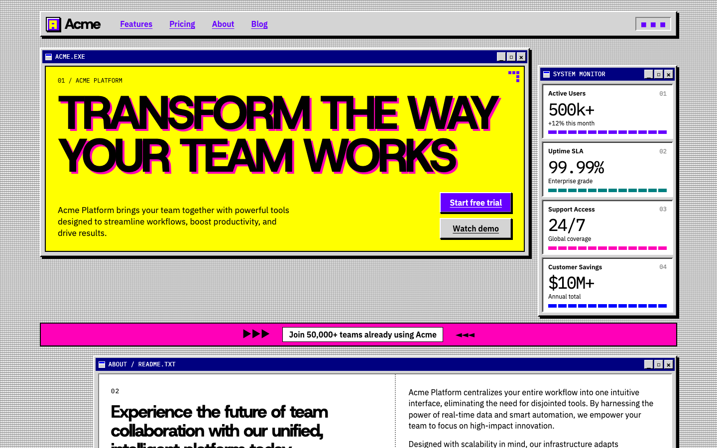
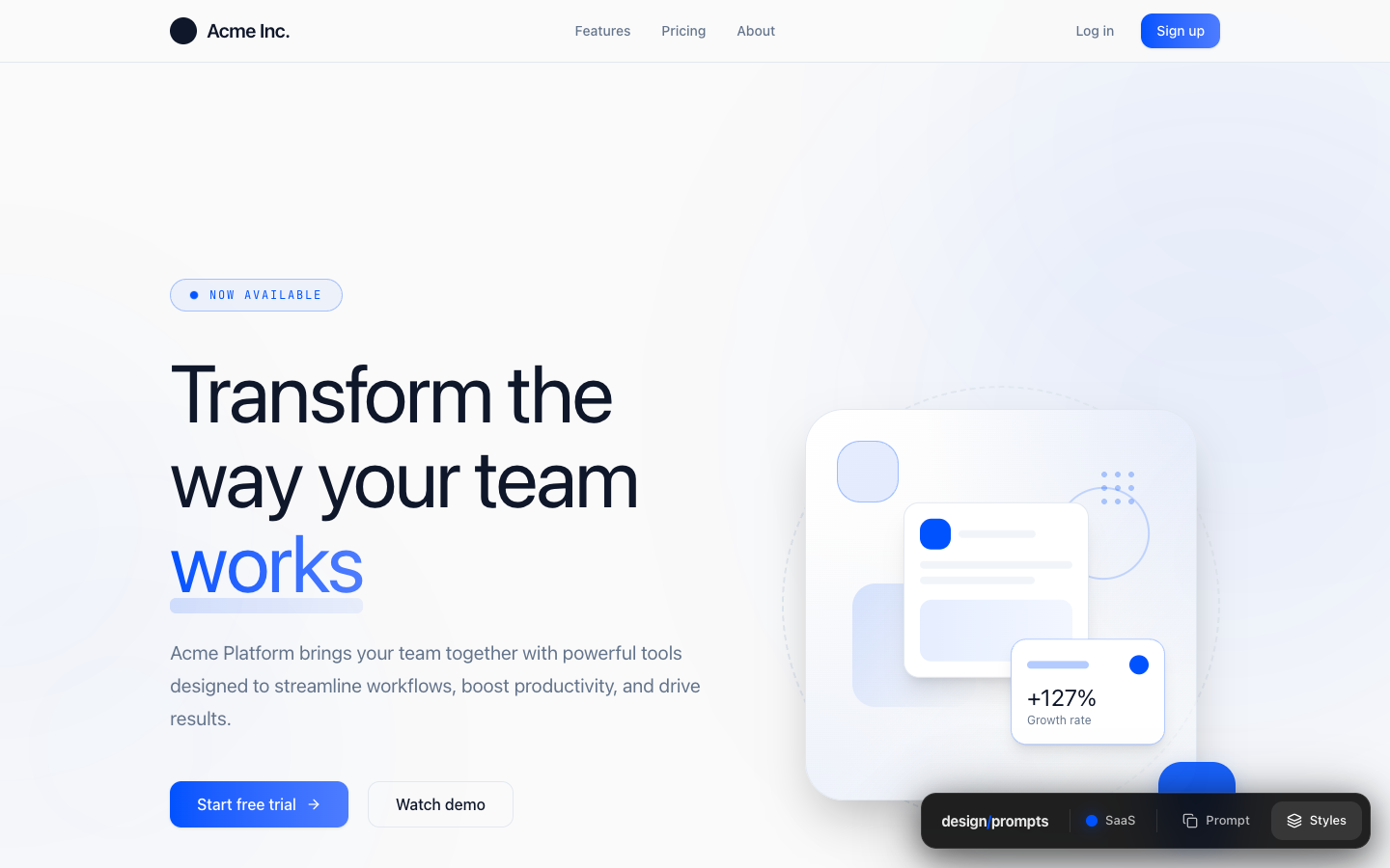
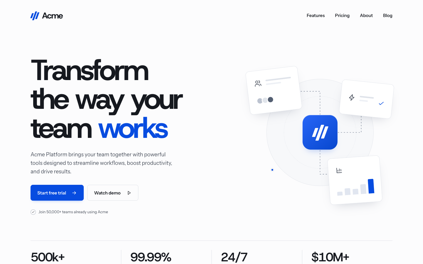
We redesigned 21 DesignPrompts styles. Here they are beside their originals, from the quiet black-and-white pages to the loudest experiments with colour and type.
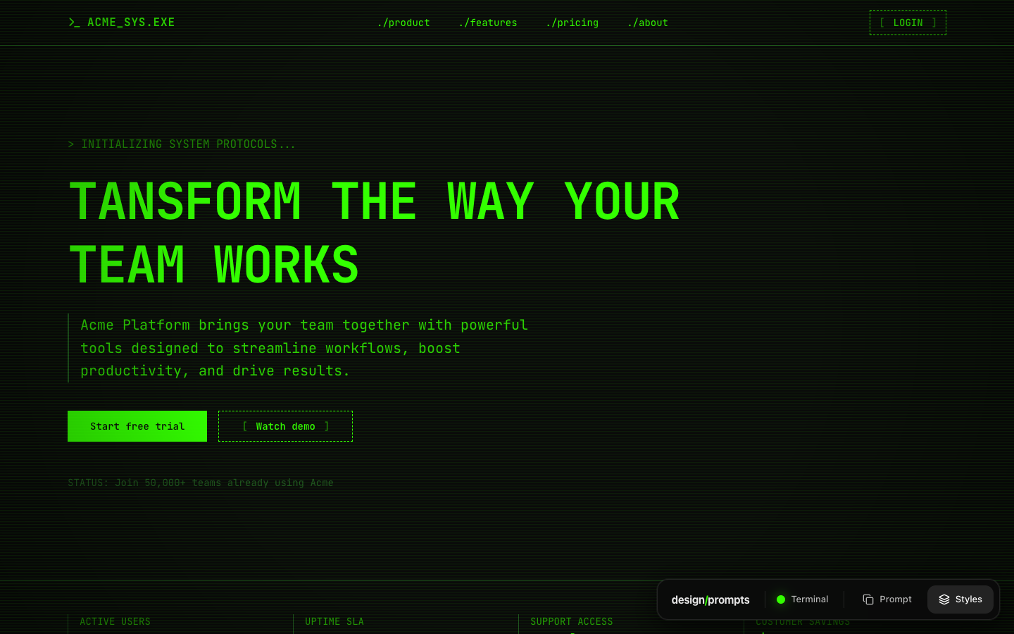
The Before images are saved captures of the original designprompts.dev pages. The After images are the approved redesigns. Each pair shows the opening at the same desktop size, 1440 by 900 pixels. The redesign also shortened the demo content, so these are visual comparisons rather than identical-content tests.
Select any image to download the full-size screenshot, or follow a style's link to explore the whole redesigned page. The contents list lets you jump straight to a design.
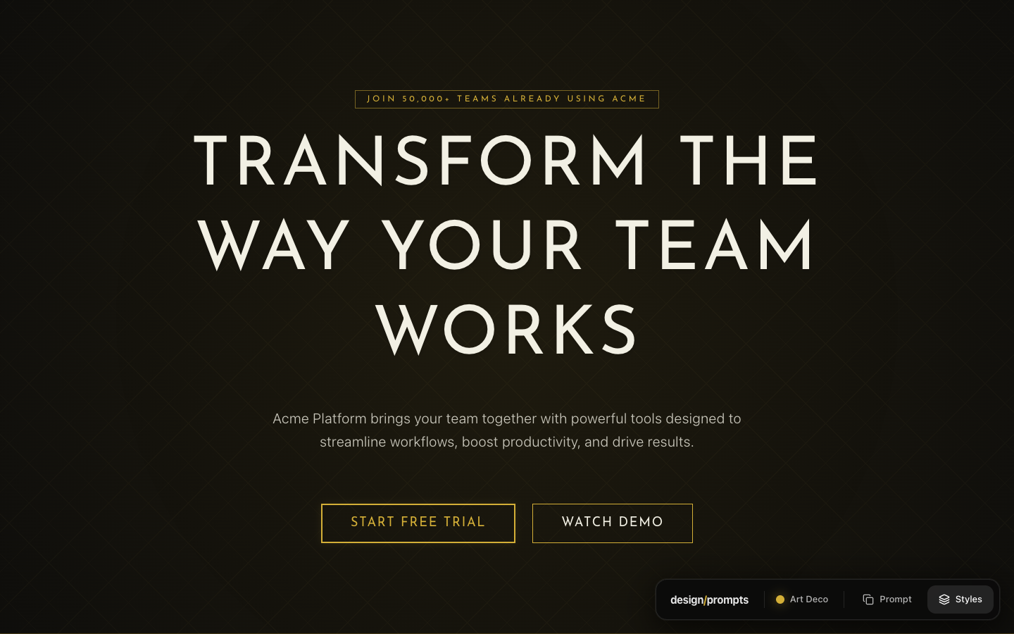
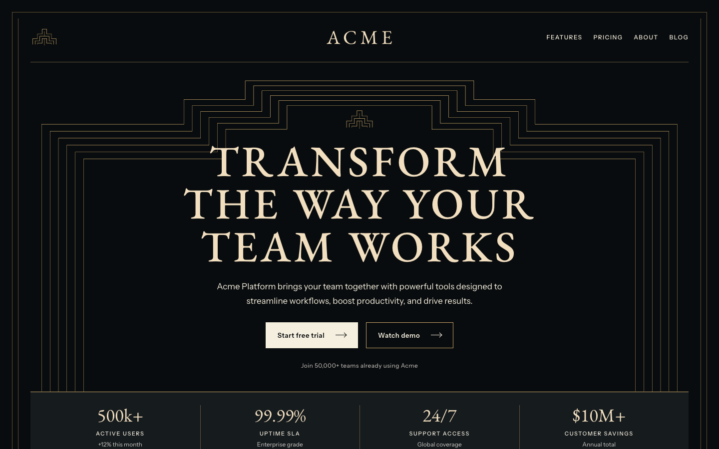
Art Deco
The thin gold outlines now step around a serif headline. A centred masthead and a framed statistics row make the opening feel like an Art Deco facade.
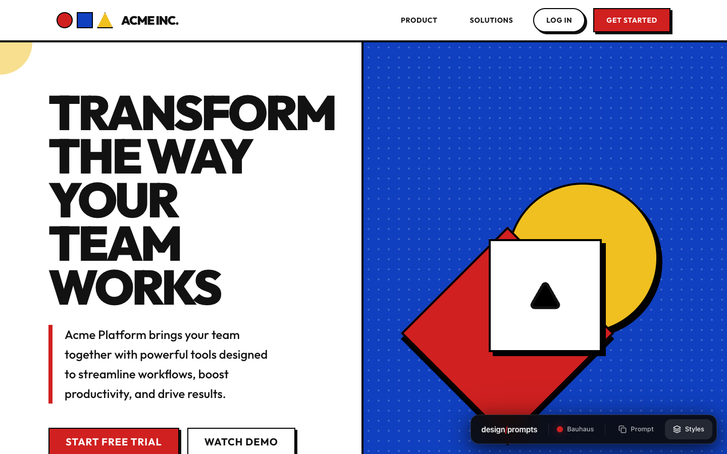
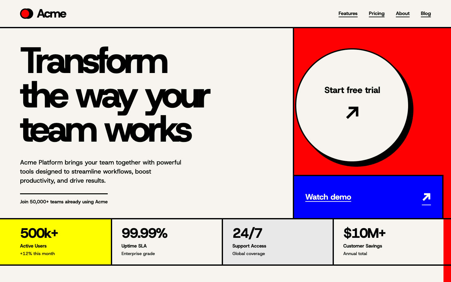
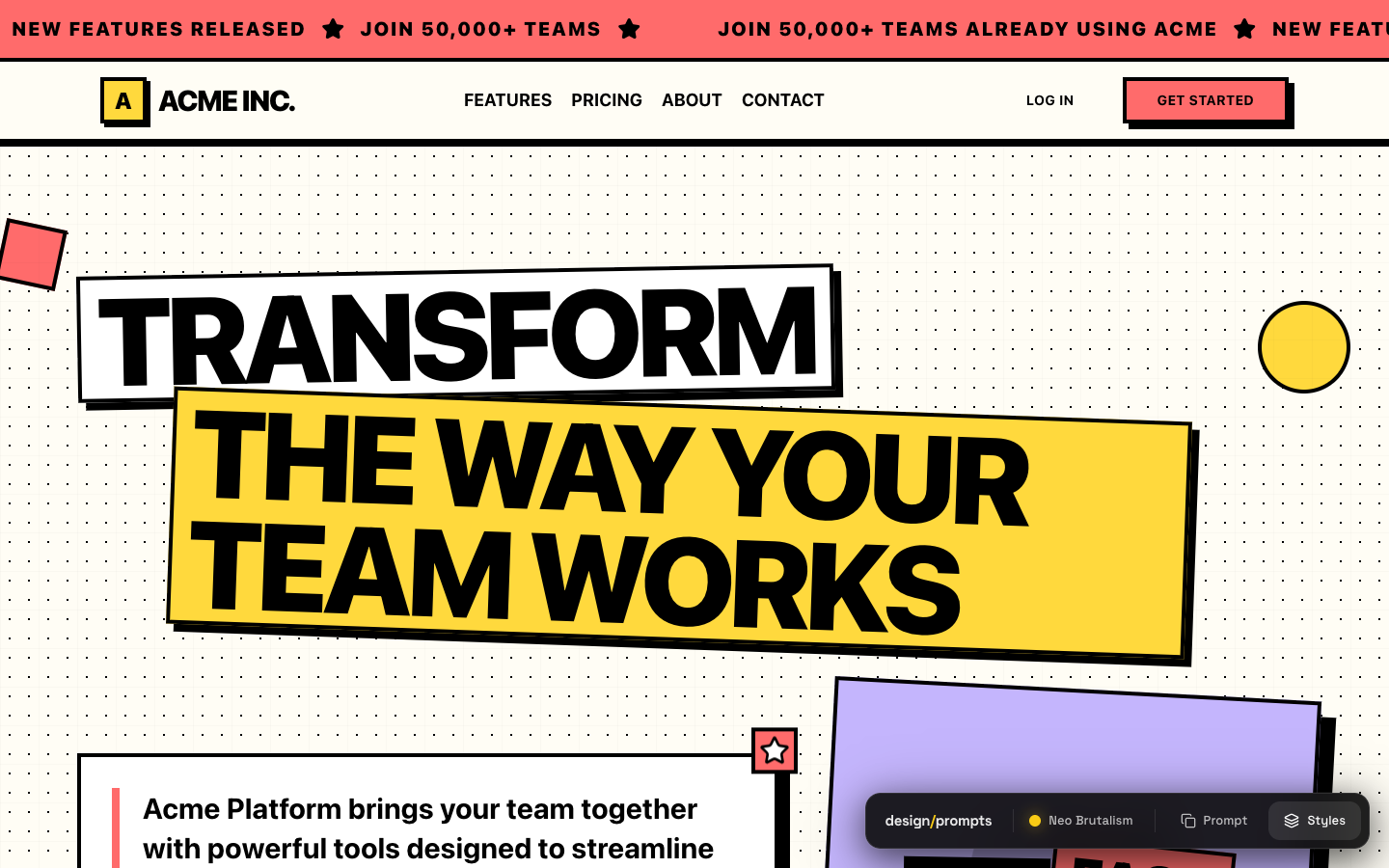
The primary colours stay. The decorative shapes become the layout itself, with a circular trial button in a red panel and a yellow block anchoring the statistics.
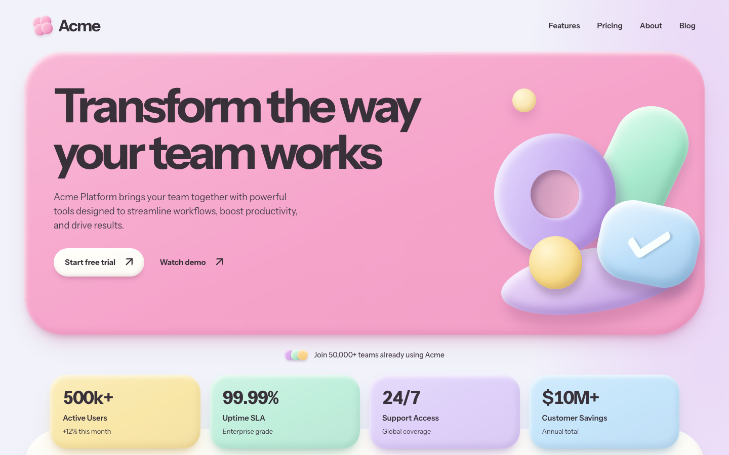
A large pink panel gathers the headline and rounded objects into one composition. The soft shadows now shape the hero and the pastel statistics blocks below it.
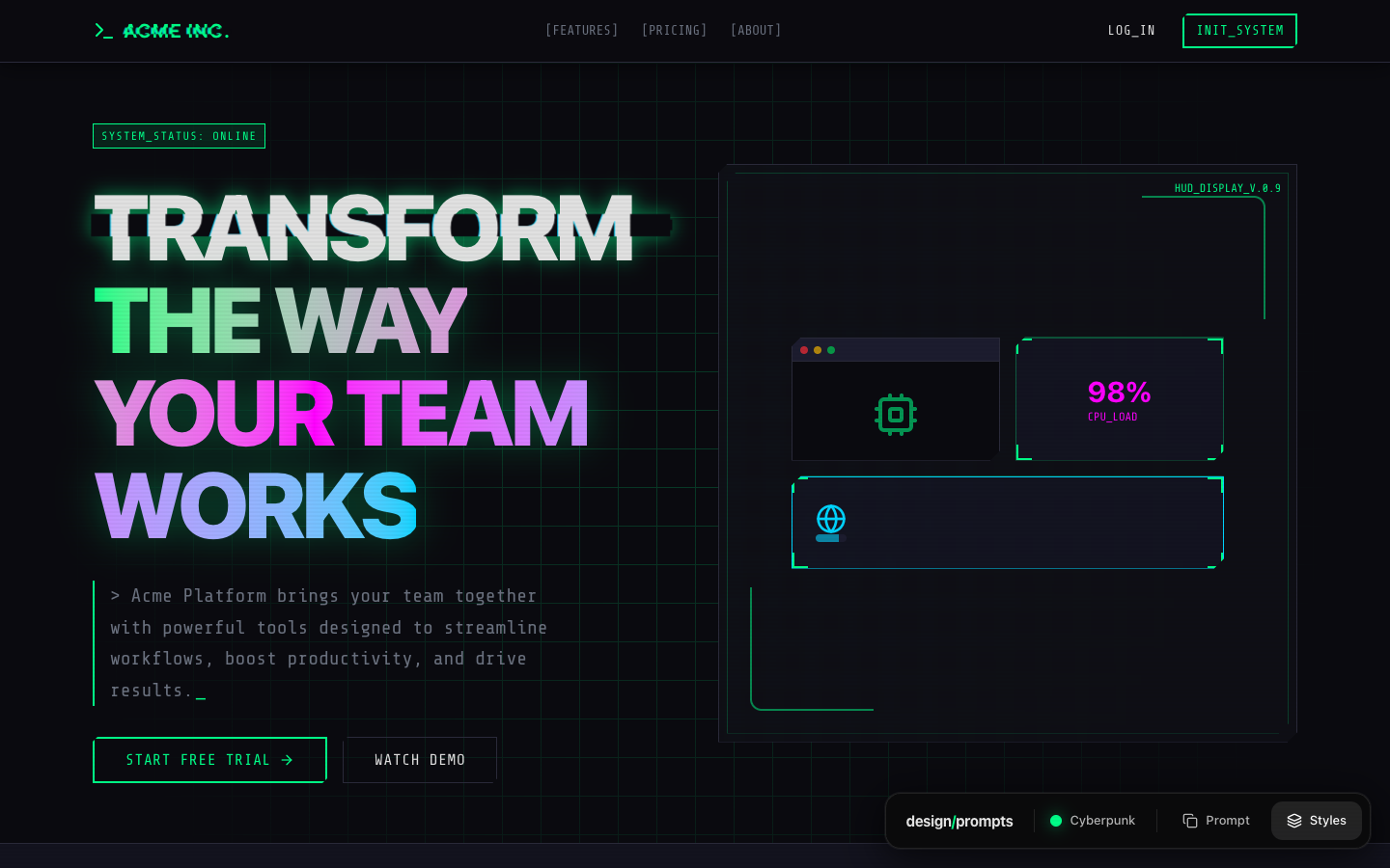
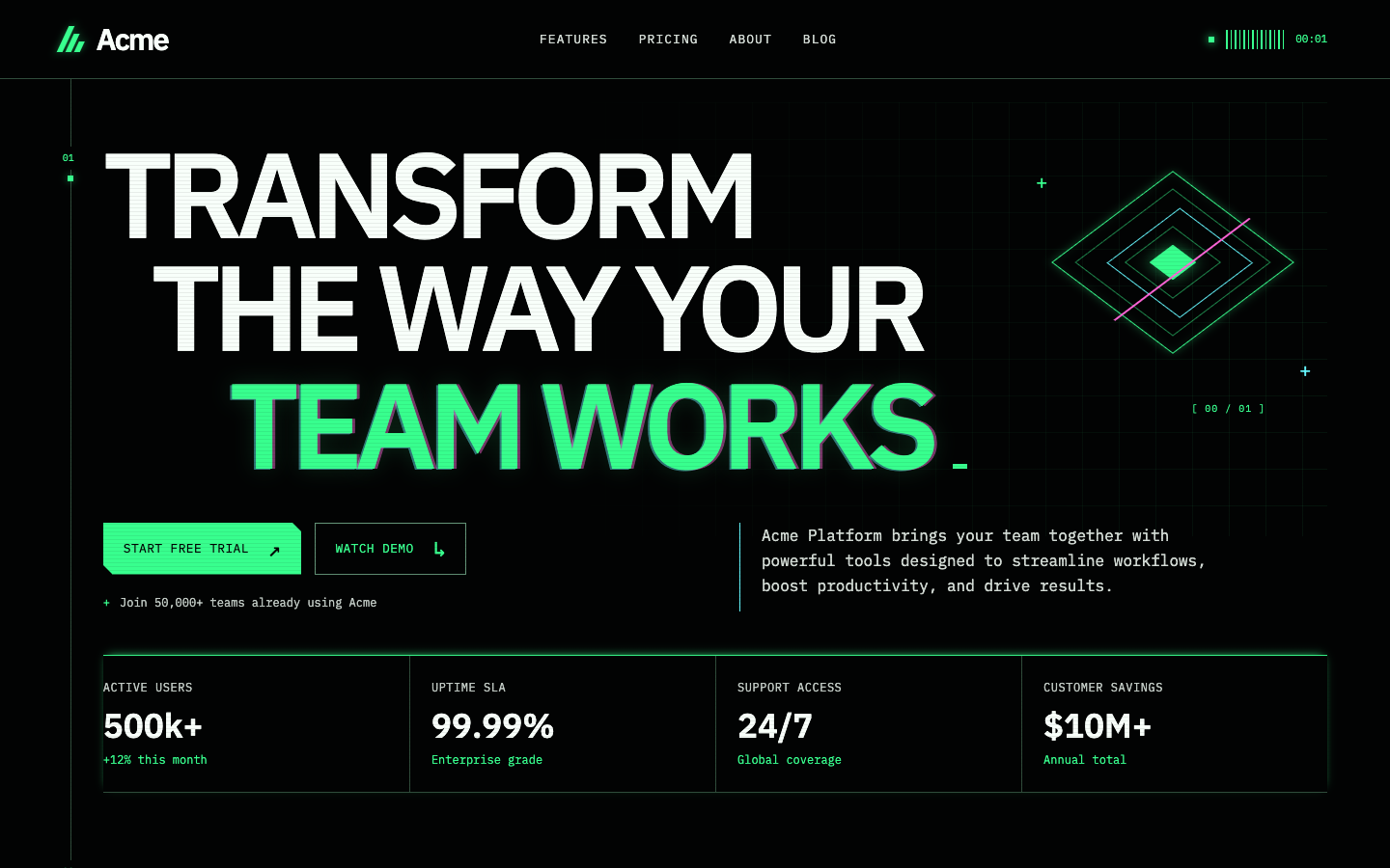
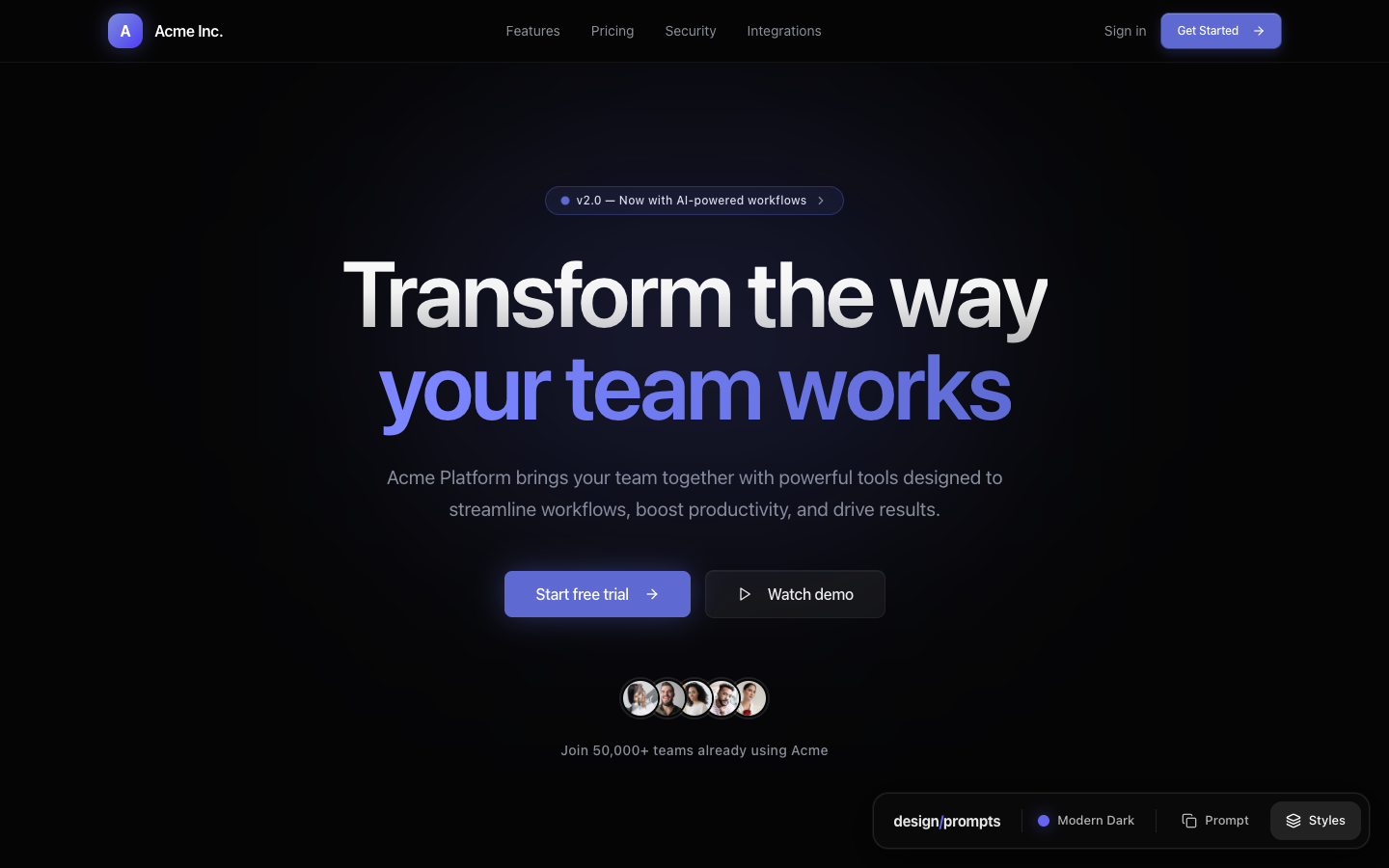
The multicoloured headline and separate dashboard panels give way to a tighter green-and-black composition. Fine grid lines and a glowing geometric mark keep the technical character.
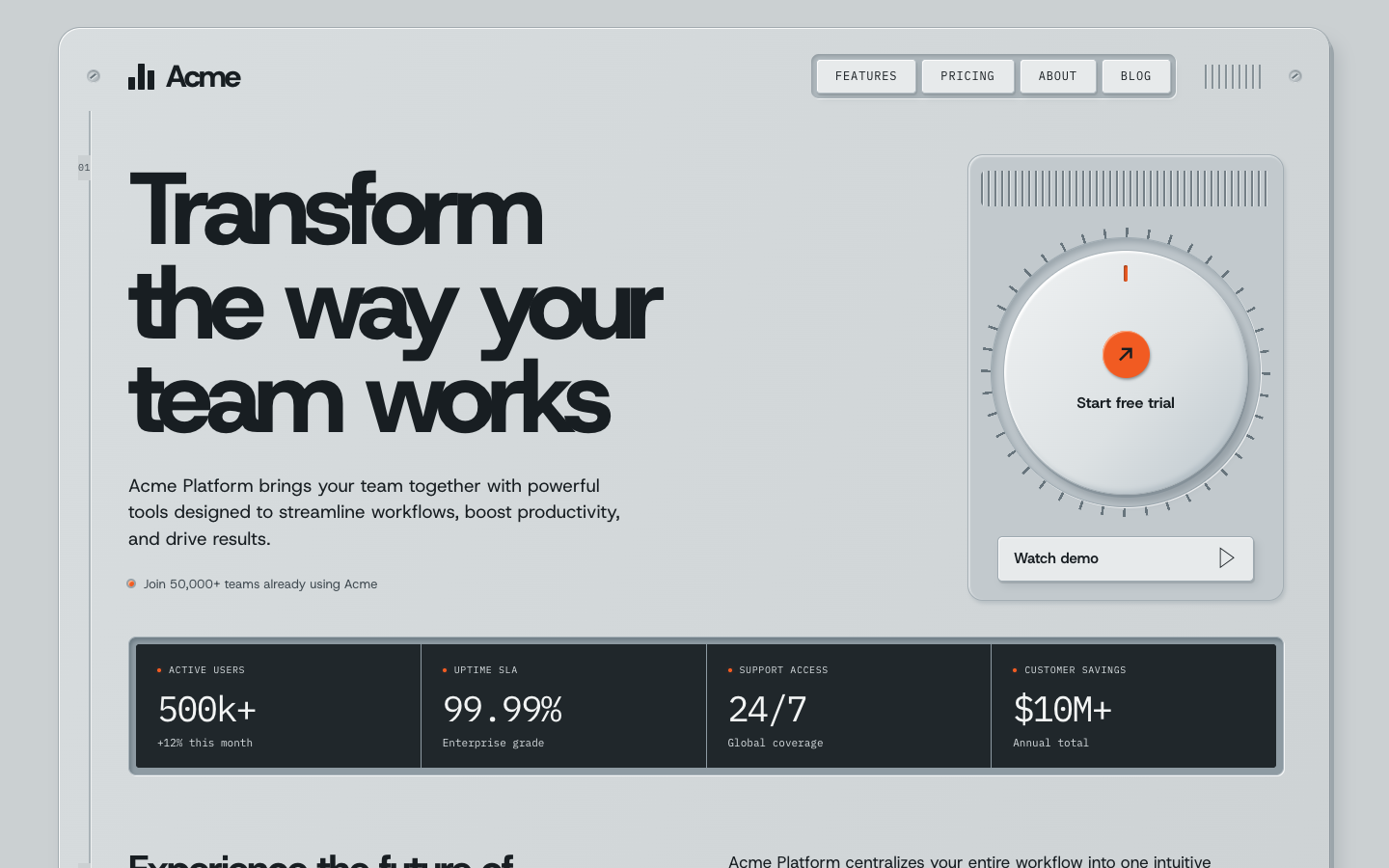
The whole opening becomes a piece of equipment. A dial holds the trial action, while screws, vents and a dark readout give the grey panel its physical detail.
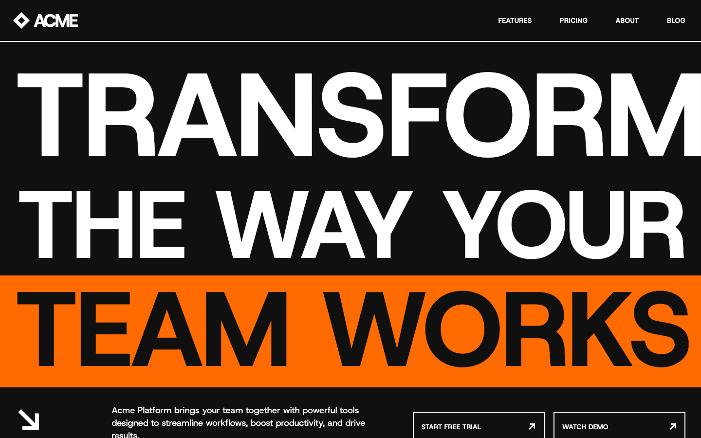
The type grows to the edges of the screen. An orange strip carries the last line, making scale and cropping the main visual event. The screenshot captures one moment of the moving page.
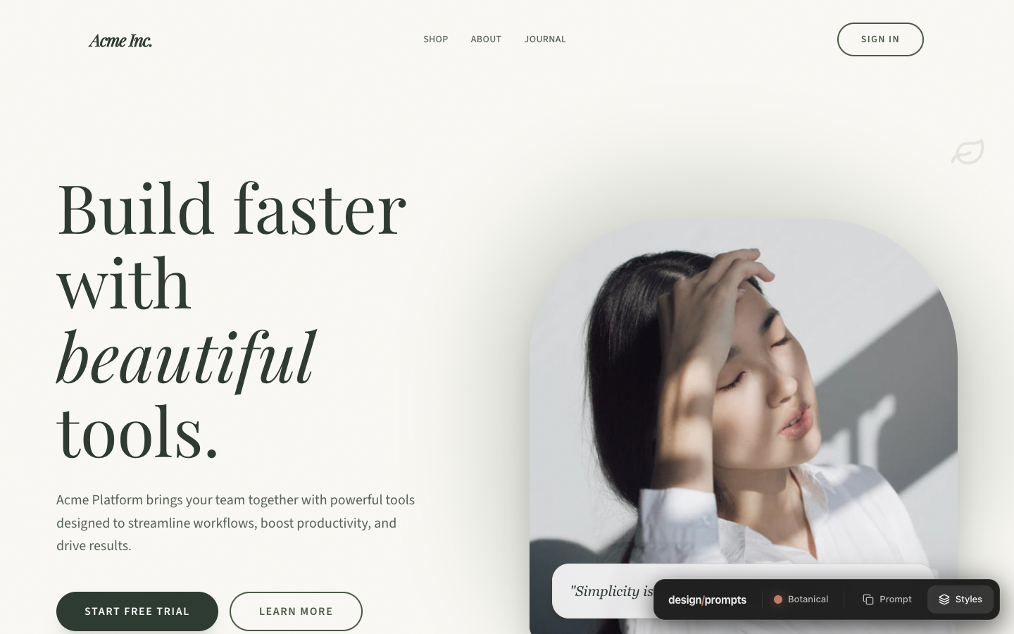
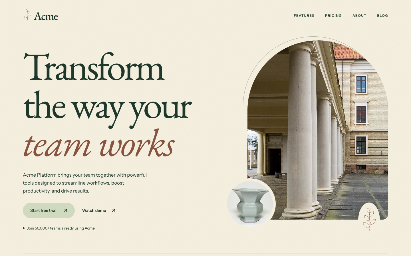
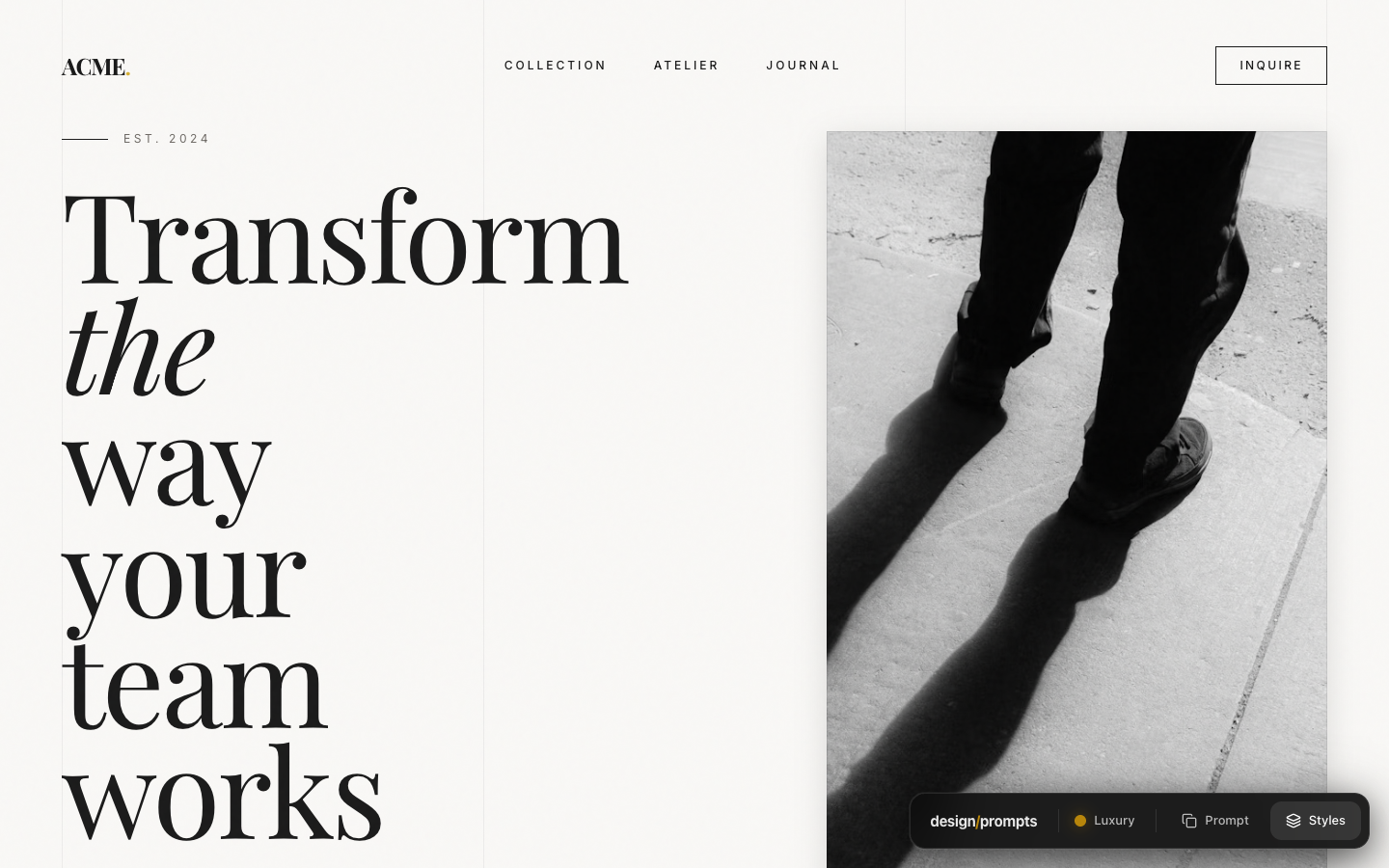
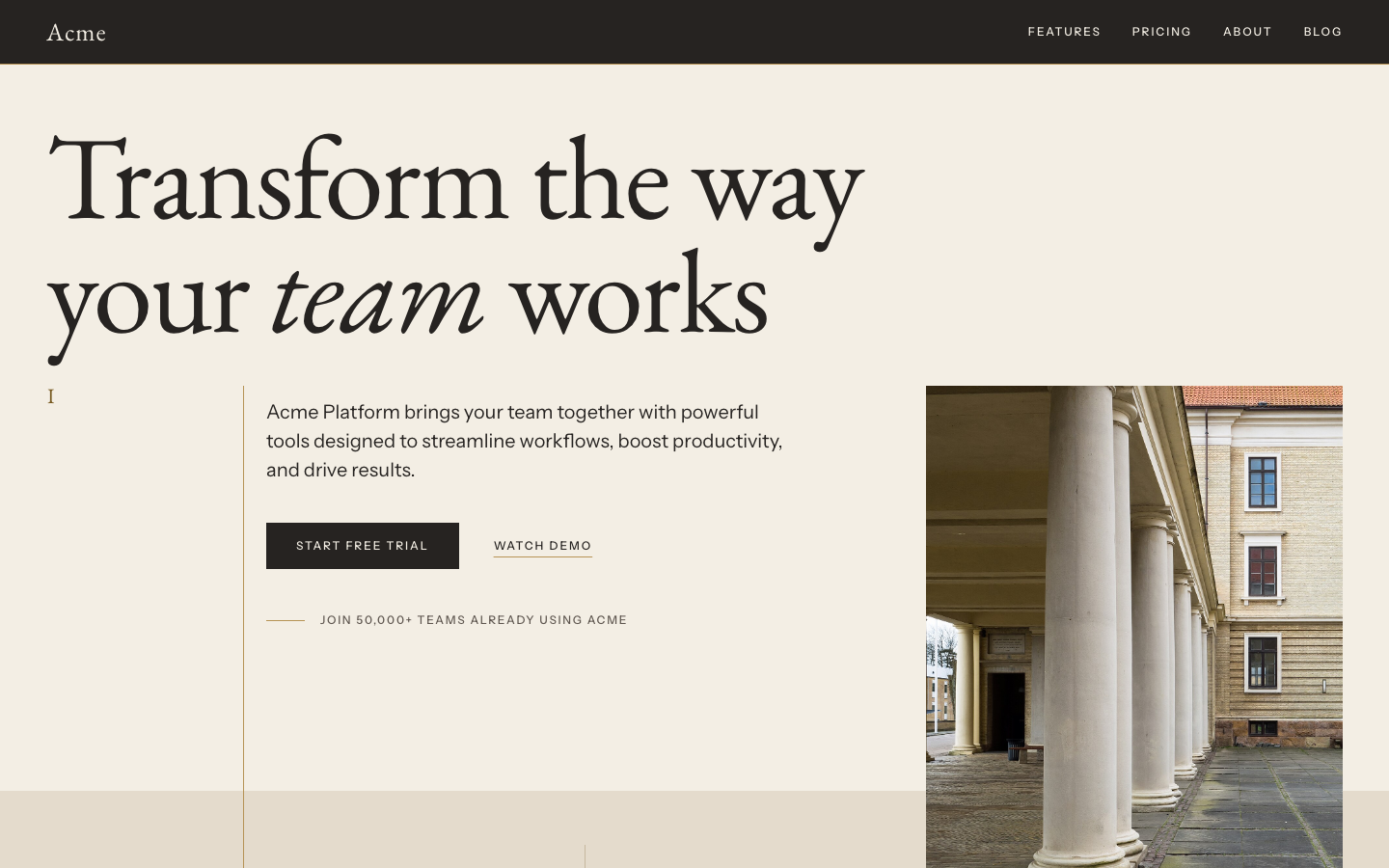
The original paired tall italic type with a black-and-white fashion photograph. The redesign opens the headline across the page, then uses a colonnade, warm stone colours and a fine gold vertical rule.
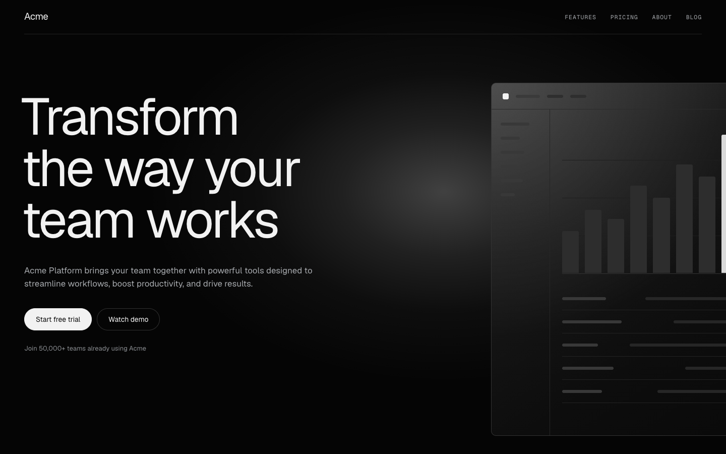
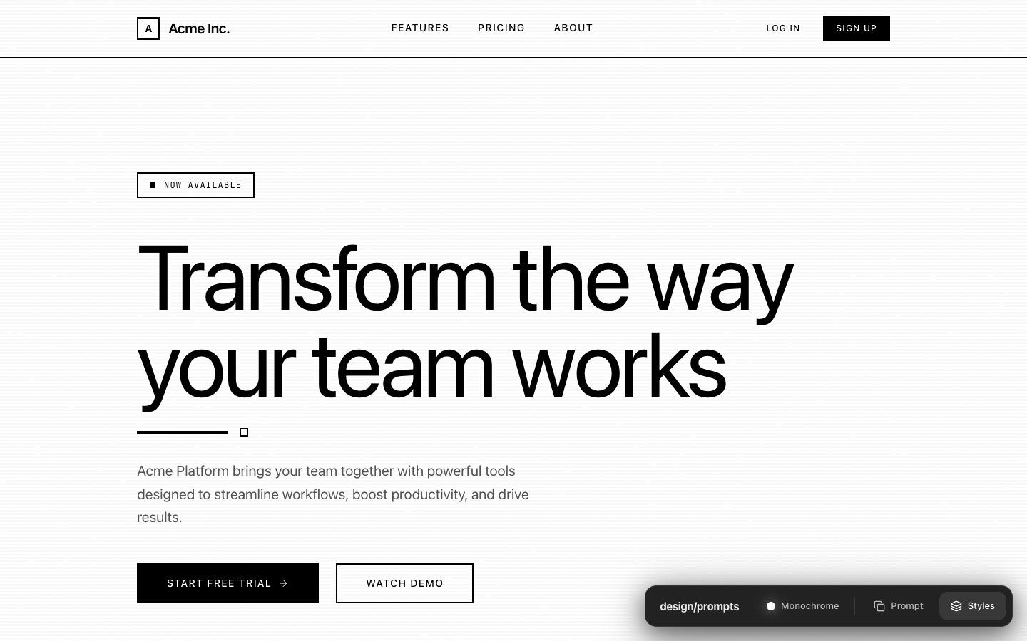
The centred hero becomes a two-column composition on a black ground. The headline stands against the left margin in a regular-weight grotesk, a constructed product panel runs off the right edge under one white light, the buttons are pills with a white primary, and no colour survives except a small live mark.
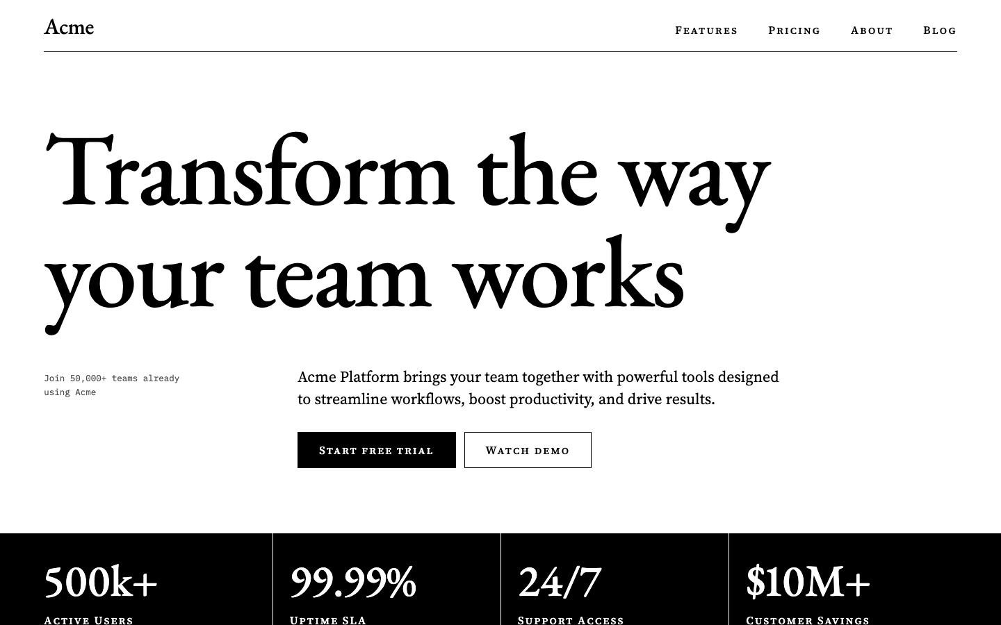
Black and white remain the entire palette. Large serif type replaces the sans-serif headline, with the supporting copy offset below it and a solid black statistics band at the bottom.
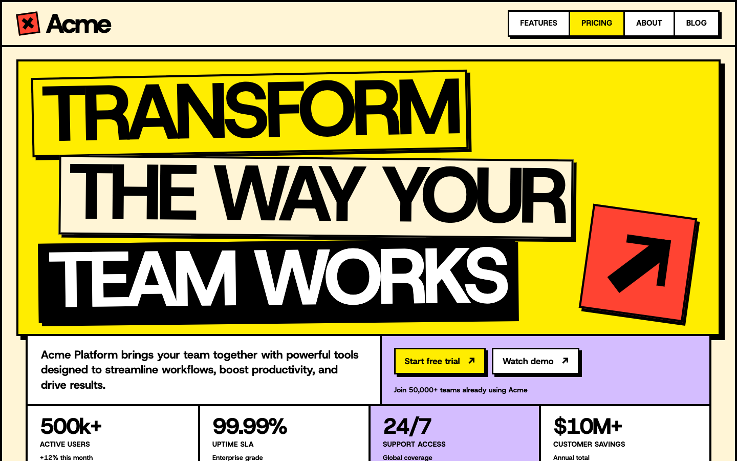
The yellow headline panel grows into a poster across the opening. Heavy outlines, offset shadows and a red arrow hold it together, while the copy and actions fit into the grid underneath.
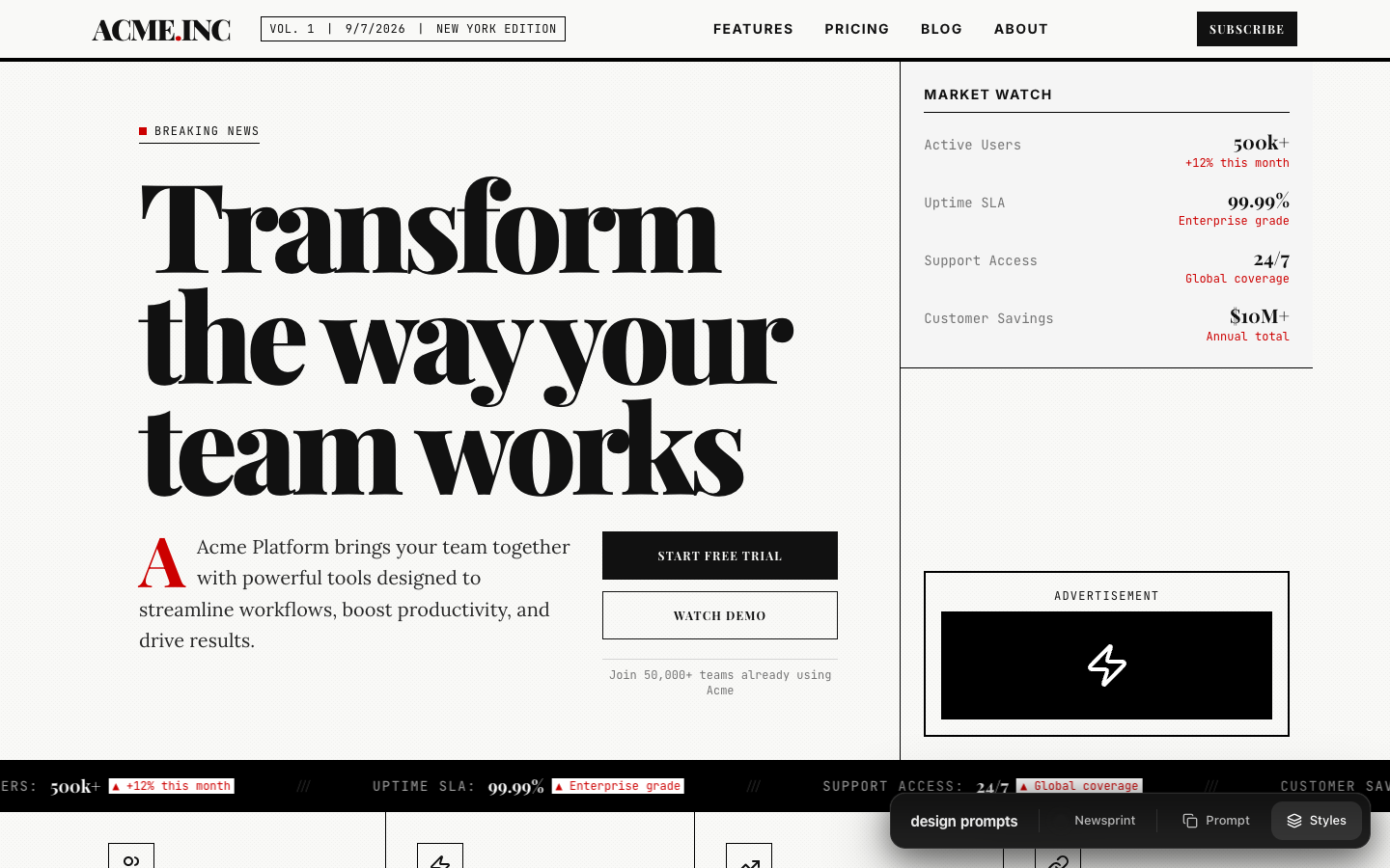
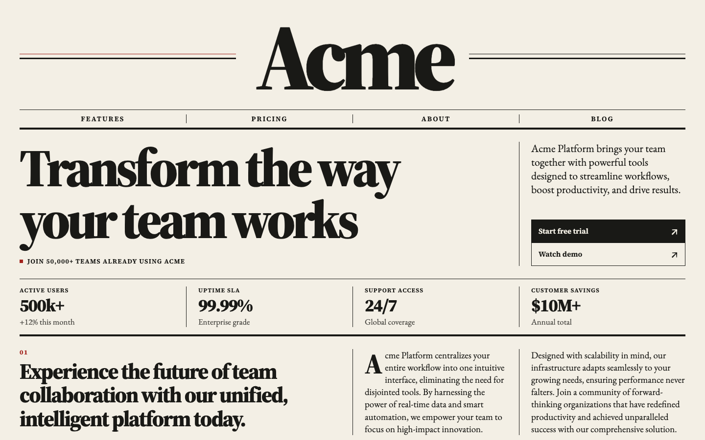
A larger newspaper masthead leads into ruled columns. The headline, supporting copy and statistics sit closer together, so the first screen reads as a composed front page.
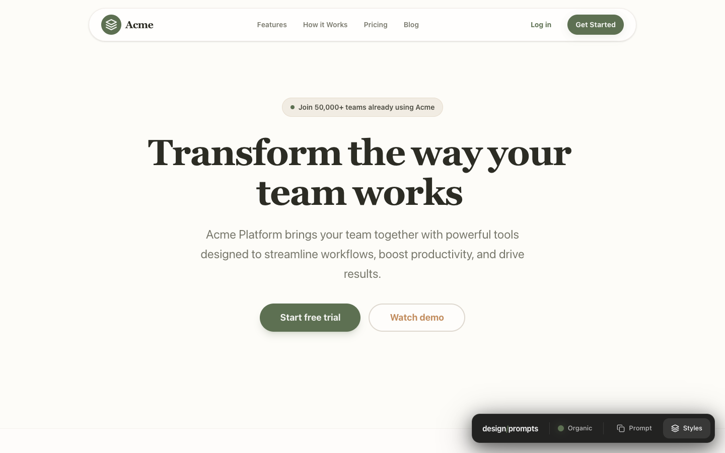
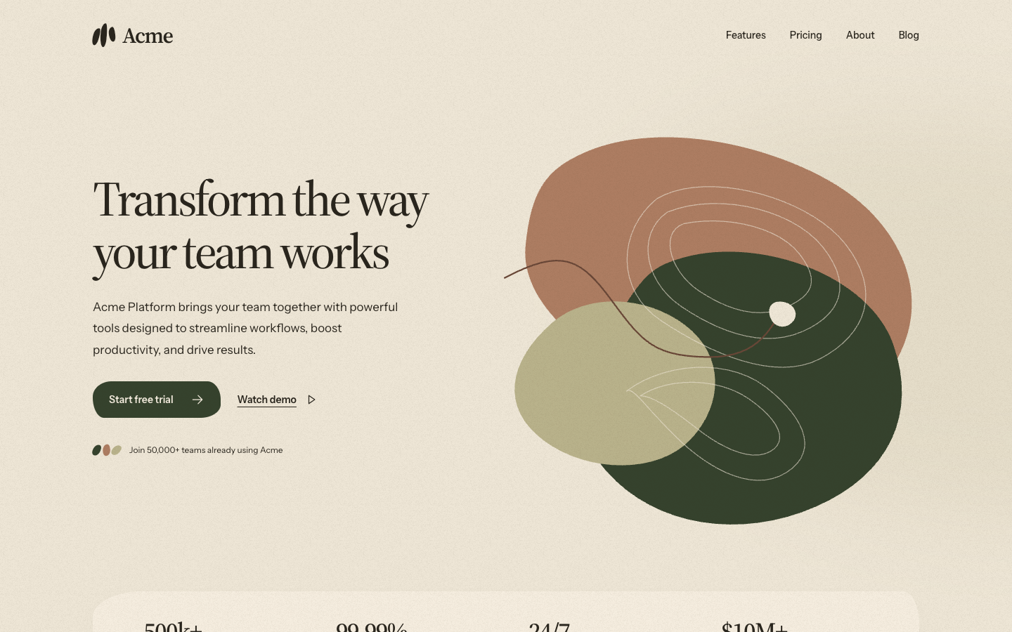
The centred cream page becomes an asymmetric arrangement. Overlapping earth-coloured shapes, looping contour lines and a paper-like background give the right side something to say.
The portrait is replaced by a group of illustrated shapes with faces, a chart and a check mark. The purple accent moves into the headline, and the statistics sit in an outlined strip.
The restrained serif direction stays, with a larger headline and an italic second line. The supporting copy and actions share a row above a quiet, evenly divided statistics section.
The grey page becomes a desktop of overlapping windows. A yellow hero window, blue title bars and a magenta ticker push the early-computer look much further.
The familiar blue-and-white palette stays. A heavier headline balances a cluster of floating product cards, with the statistics aligned along the bottom of the opening.
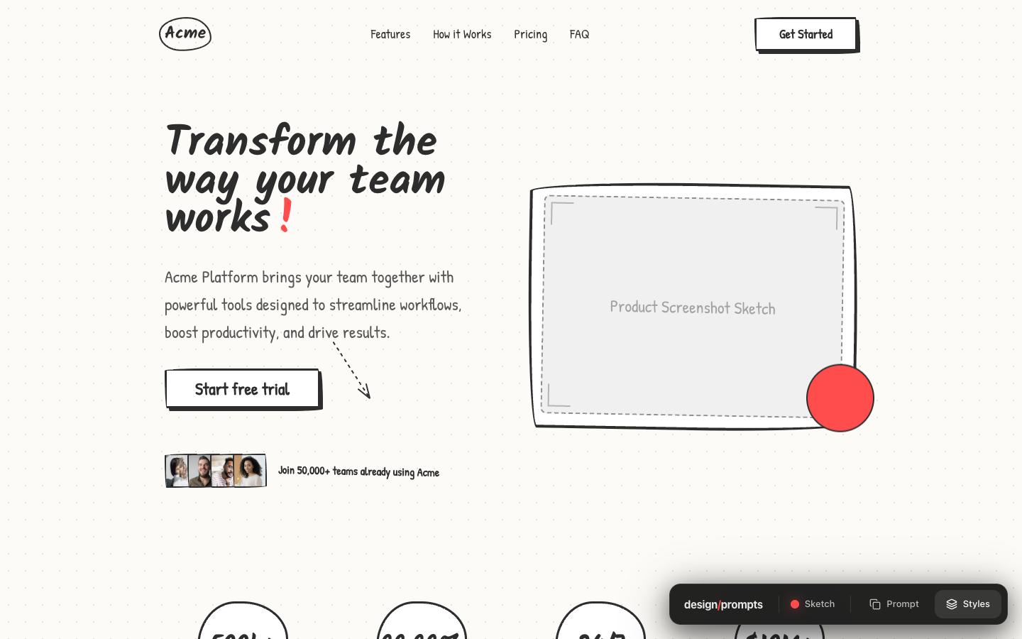
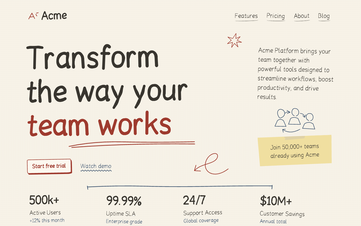
The empty sketched product frame gives way to a looser arrangement of handwriting, arrows and a sticky note. A red underline draws attention to the last line of the headline.
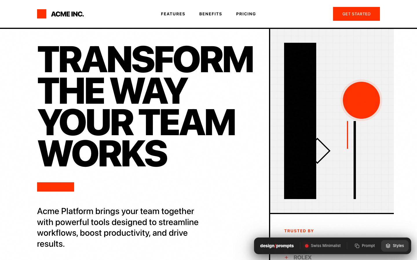
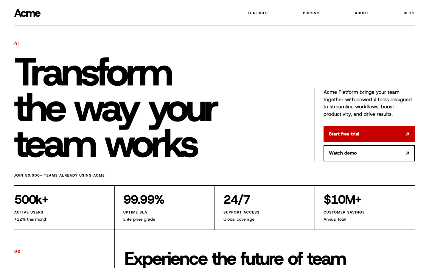
The geometric illustration is removed. The typography, thin rules and tightly aligned statistics carry the composition, with red reserved for the main action and small section numbers.
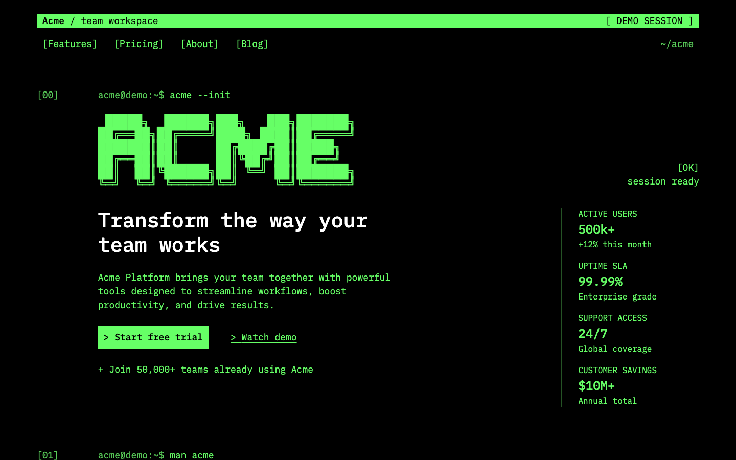
The redesign leans into the command-line setting with a text banner, bracketed navigation and a large pixel-lettered Acme mark. A narrow statistics column reads like terminal output.
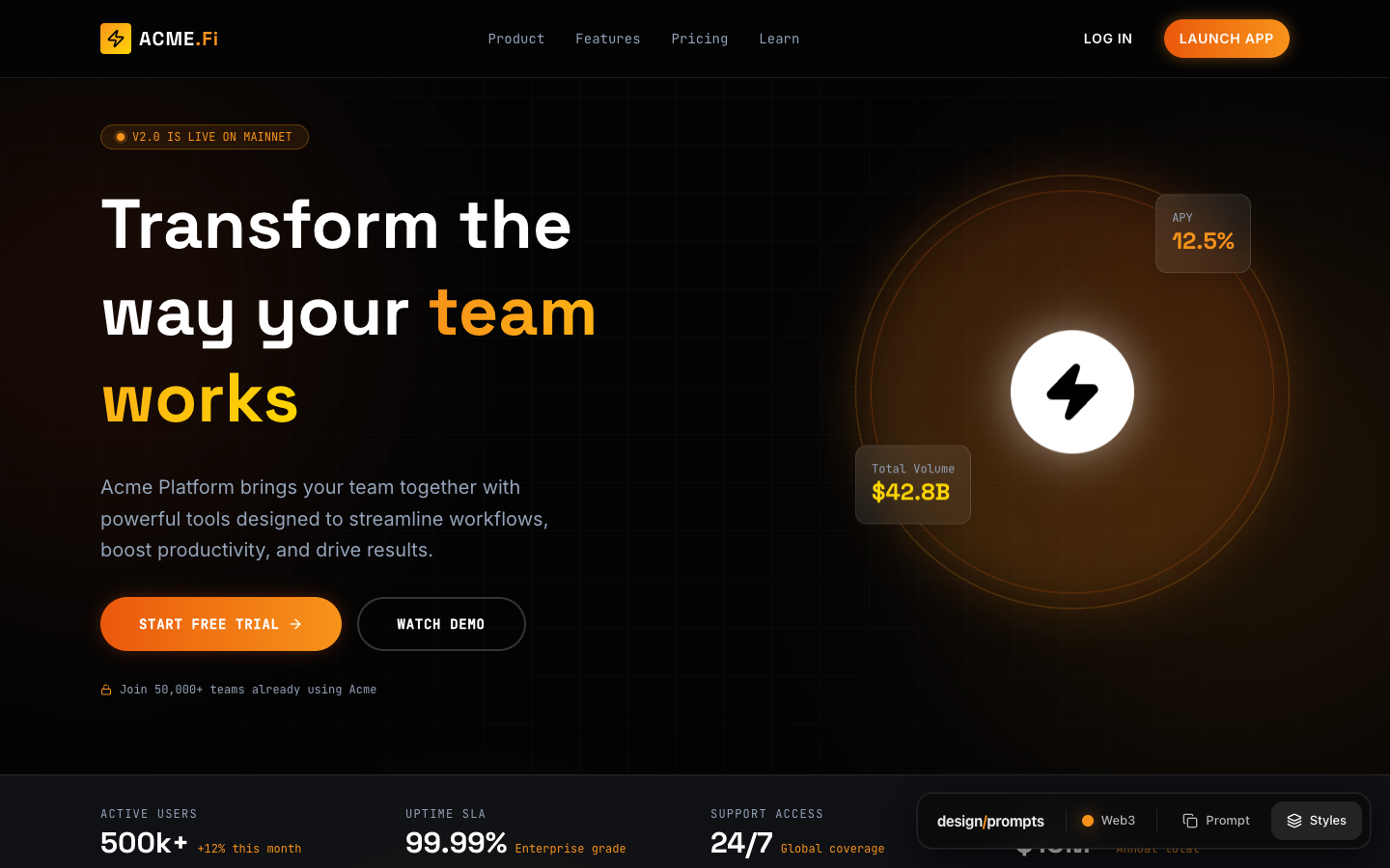
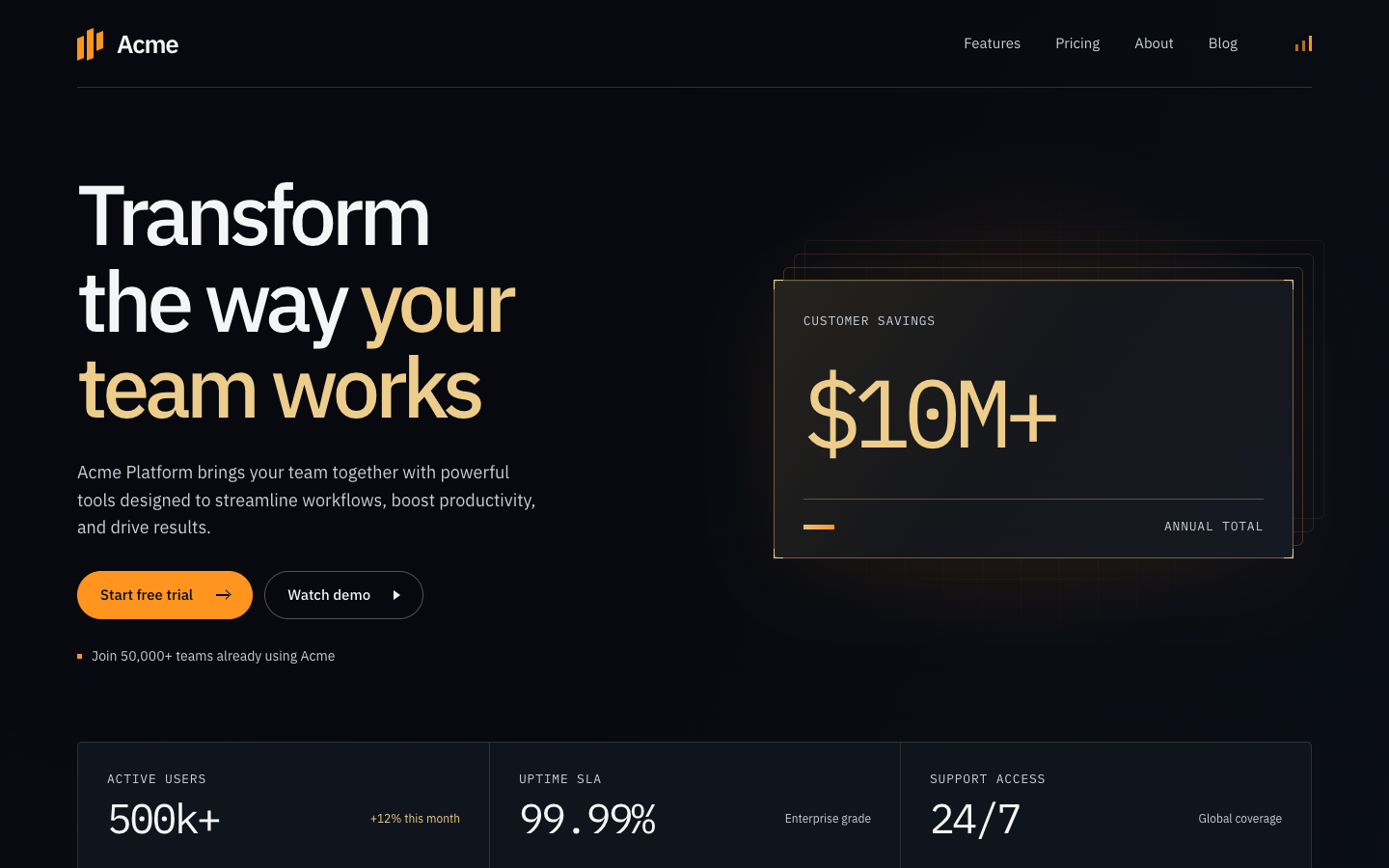
The glowing token graphic becomes a stack of outlined financial cards. Gold type and orange actions stay against the dark ground, while the statistics form a single row below.